
Client | Korean Publishers Association 대한출판문화협회
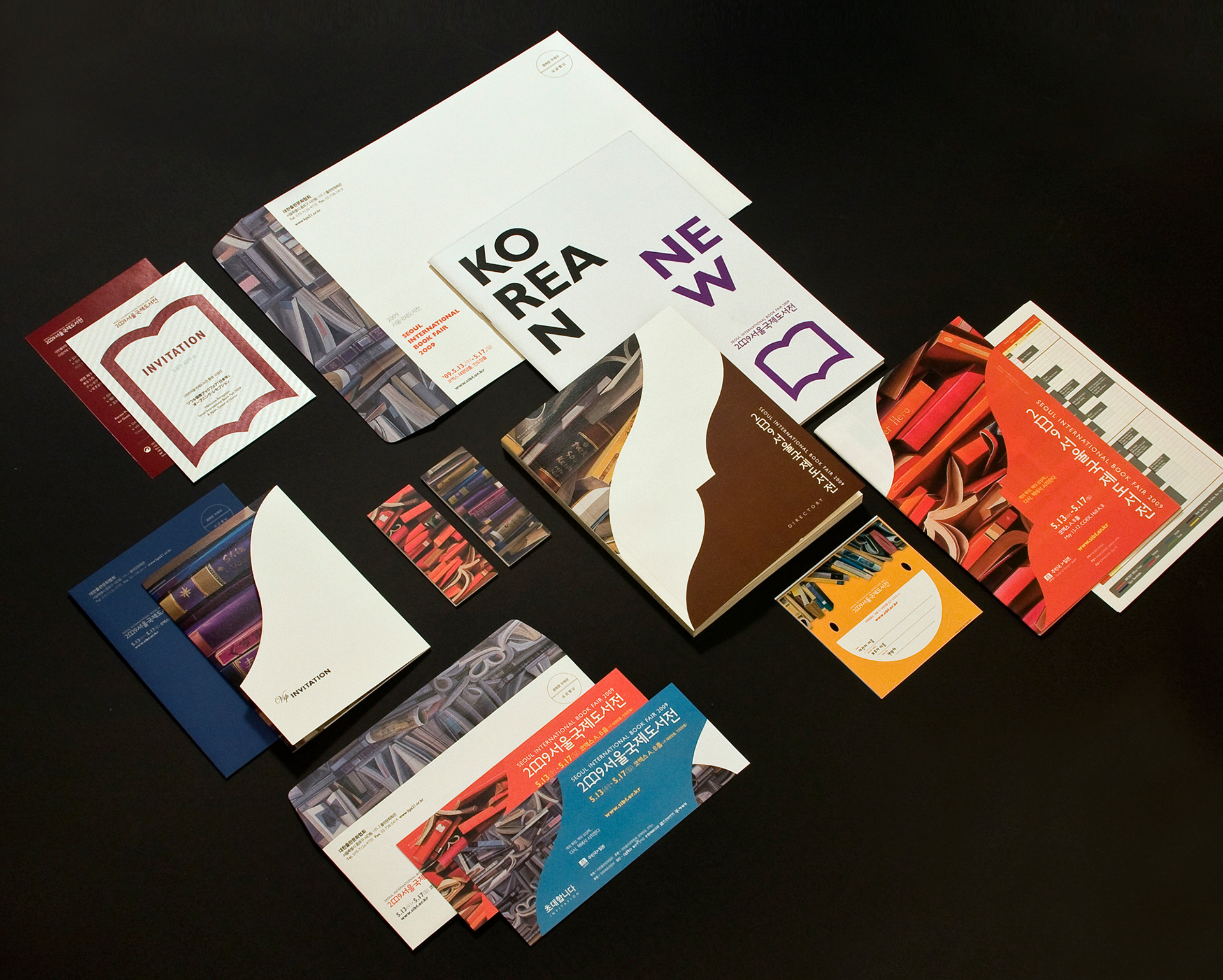
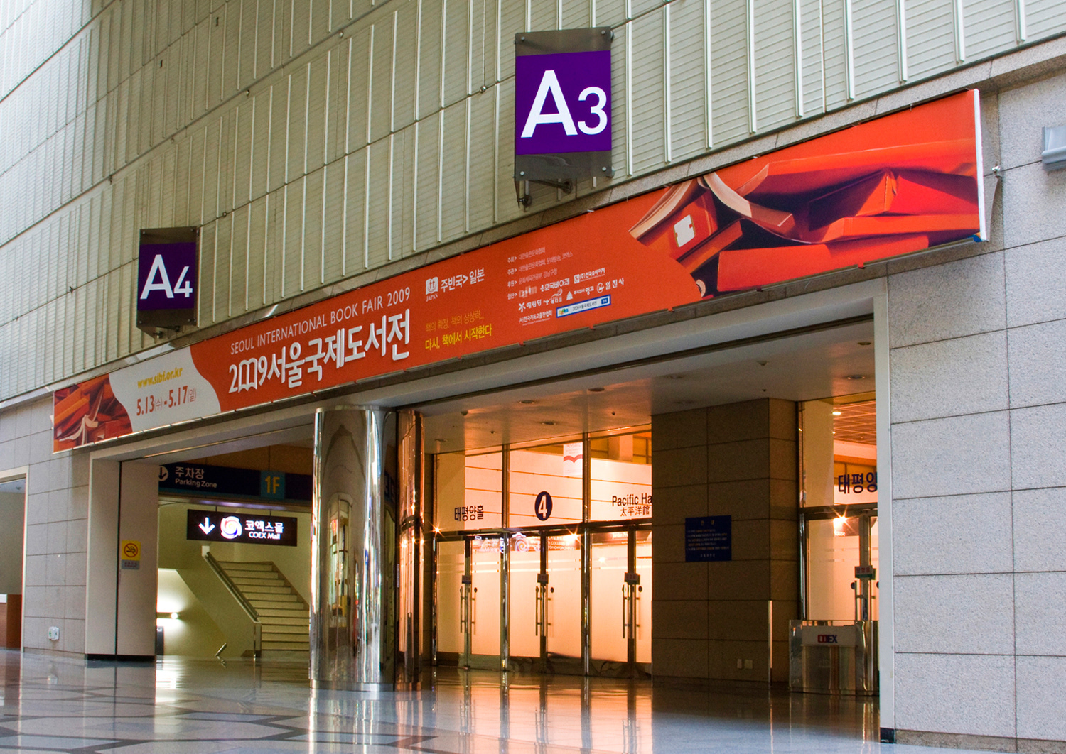
Fair identity design for Seoul International Book Fair 2009, which was organised by Korean Publishers Association, taking place at COEX(Convention and Exhibition Centre, World Trade Centre) every year. In 2009, Japan was invited as the guest country of honour along with many publishes from different continents. Design process is conducted from visual research to the case studies, logo type design and design motif, colour concept and applications. This event was organised with Seoul International Book Art Fair 2009 at the same time and in the same place, and gave the public valuable opportunity to enjoyment of reading and listening to lots of authors in lectures, conferences and seminars. This is one of the biggest events in Seoul, Korea.
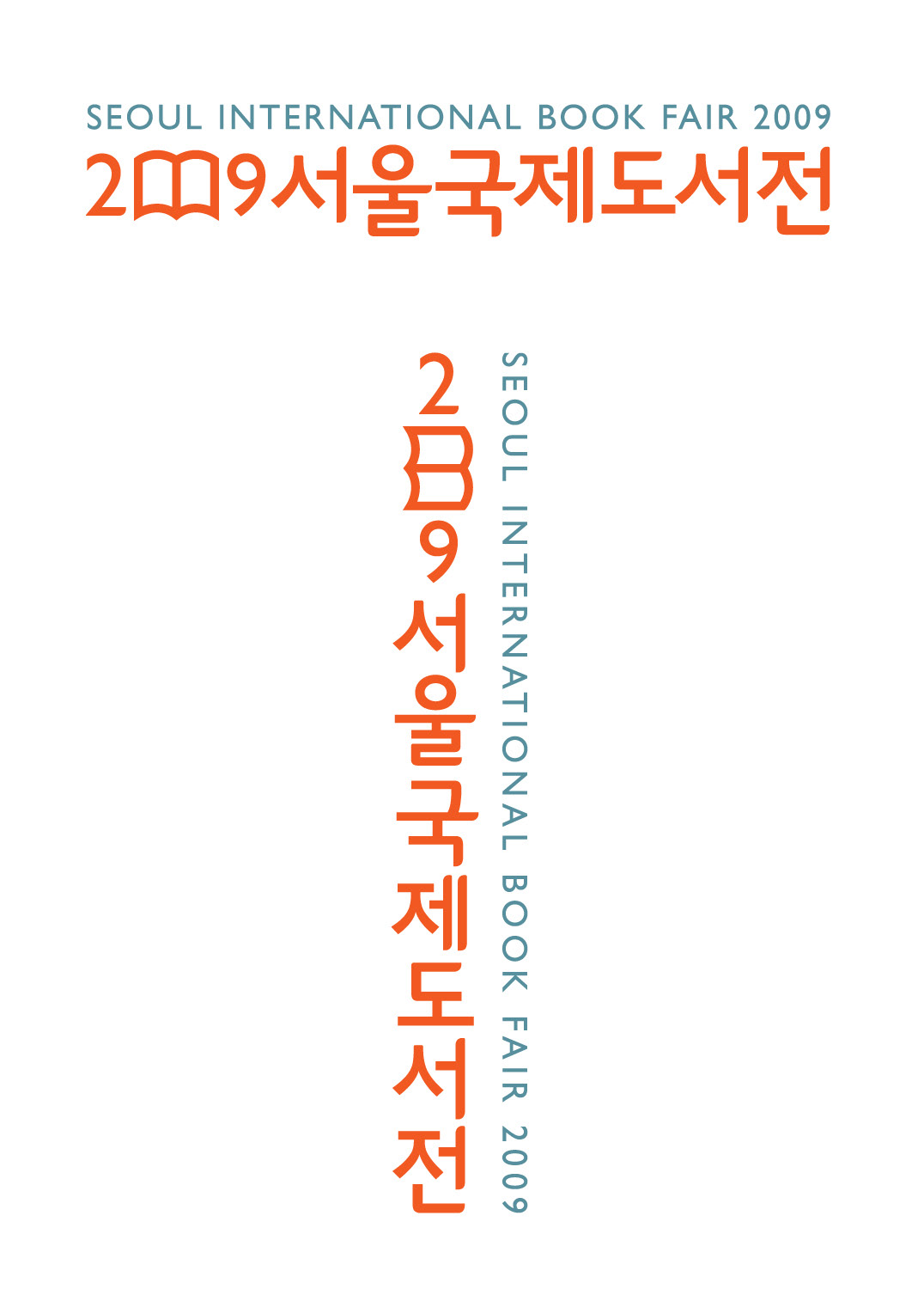
Main Logo
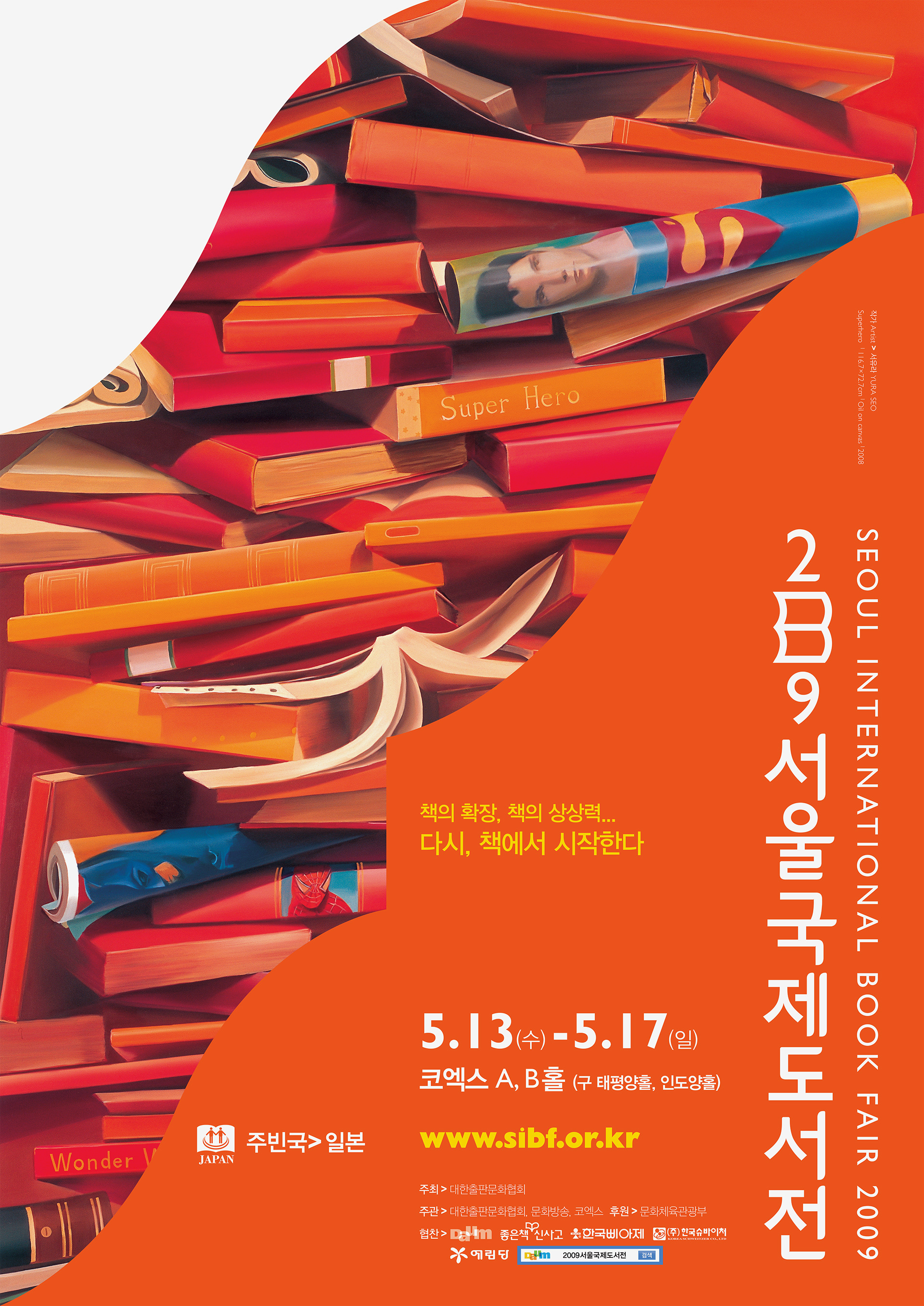
Main Poster – Portrait
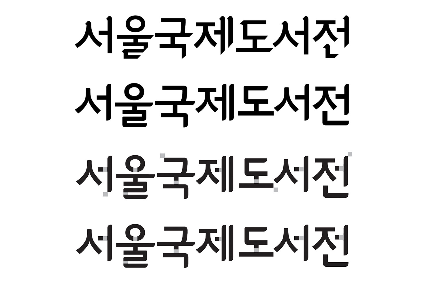
A Korean Letter, 'Hangul', consists of 19 consonants and 21 vowels, which make combinations of 11,172 letters. Designing Korean letter mark is also pretty difficult comparing to Alphabet based design. Some letters have three structures horizontally and vertically, and this geometric combination conveys modern and minimal graphic tone. The letter mark was designed for the fair exclusively and inspired by the shape of books and pages. Curves and rounded corner represent the sense of a book page. A main logo font and a symbol were exclusively designed for the fair only. It was collaborated with a type designer,Youngmi Seo.
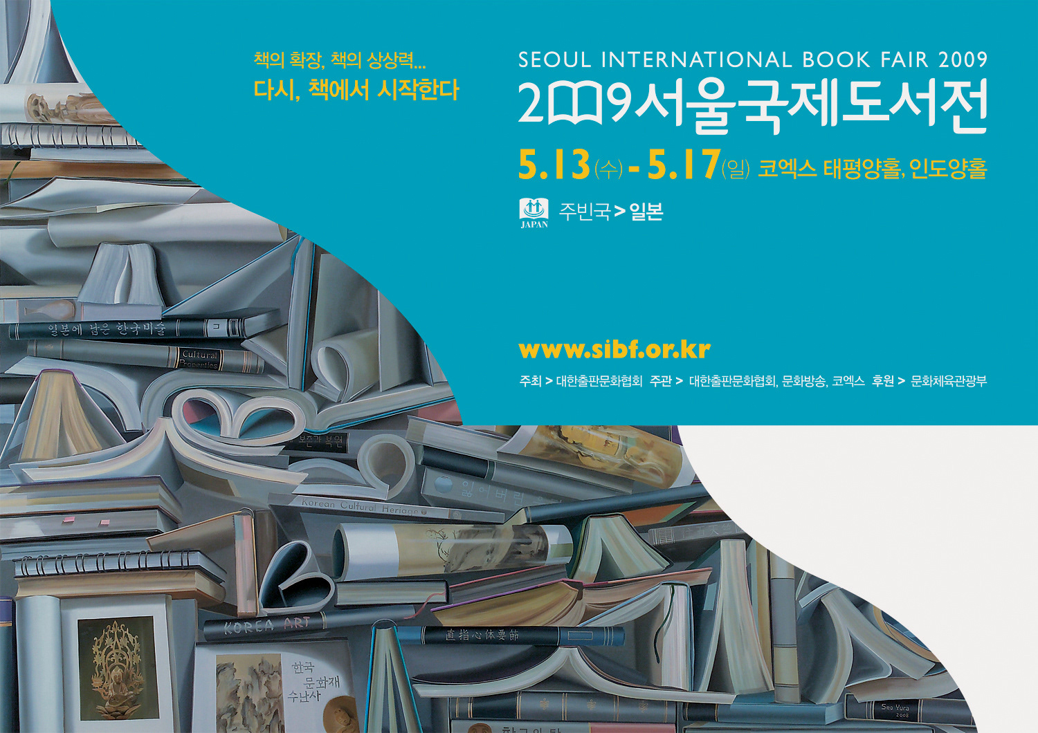
Main Poster – Landscape
Concept
A main graphic motif was thoroughly organised and applied to all the materials: A poster, banners, advertisement, a directory book, invitation cards, tickets, a brochure, envelopes and bookmarks. Two ways were used to support the concept. One is a painting by artist Yura Seo, who illustrates books stacked and rolled randomly and the other is a graphic motif from the shape of book such as curled pages and rounded lines, a dog-ear etc. Main colour concept is scarlet and sky blue. The two colours are vibrant and contrasted with other supportive colours, violet, purple, olive green, cobalt blue and yellow. Colours are applied to the graphic motif shapes with the paintings. Gill Sans is used as a main font, which was considered most appropriate typeface illustrating the image of a book.
A main graphic motif was thoroughly organised and applied to all the materials: A poster, banners, advertisement, a directory book, invitation cards, tickets, a brochure, envelopes and bookmarks. Two ways were used to support the concept. One is a painting by artist Yura Seo, who illustrates books stacked and rolled randomly and the other is a graphic motif from the shape of book such as curled pages and rounded lines, a dog-ear etc. Main colour concept is scarlet and sky blue. The two colours are vibrant and contrasted with other supportive colours, violet, purple, olive green, cobalt blue and yellow. Colours are applied to the graphic motif shapes with the paintings. Gill Sans is used as a main font, which was considered most appropriate typeface illustrating the image of a book.
Applications
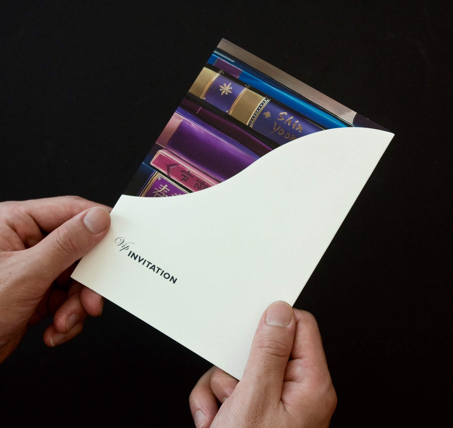
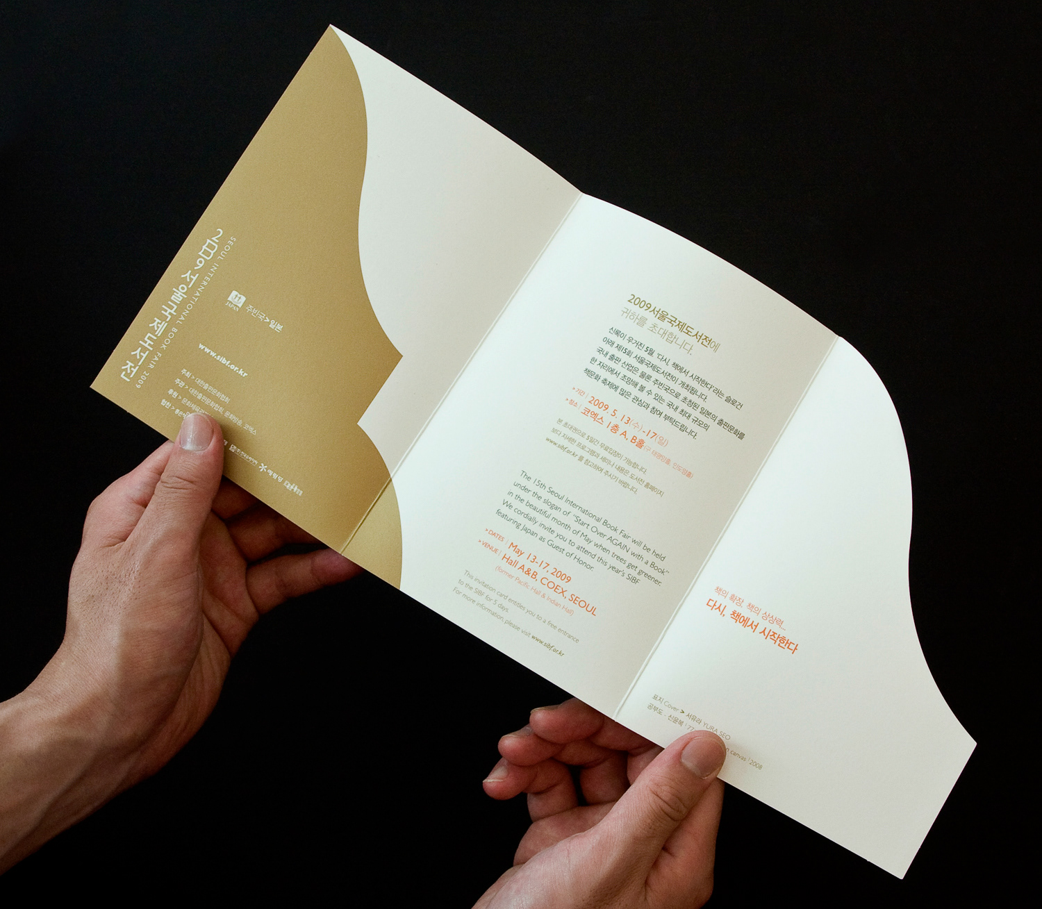
VIP Invitation Card
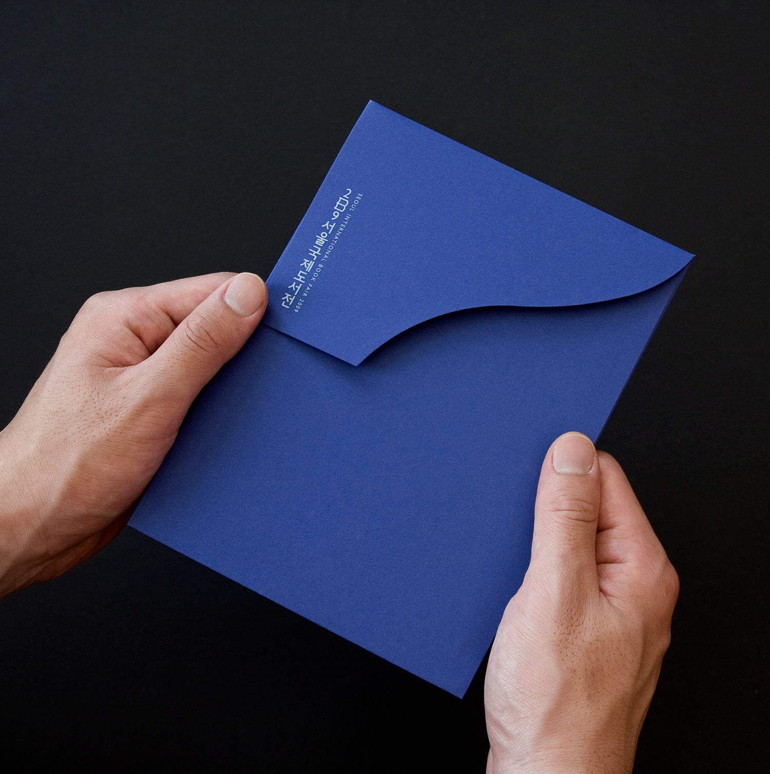
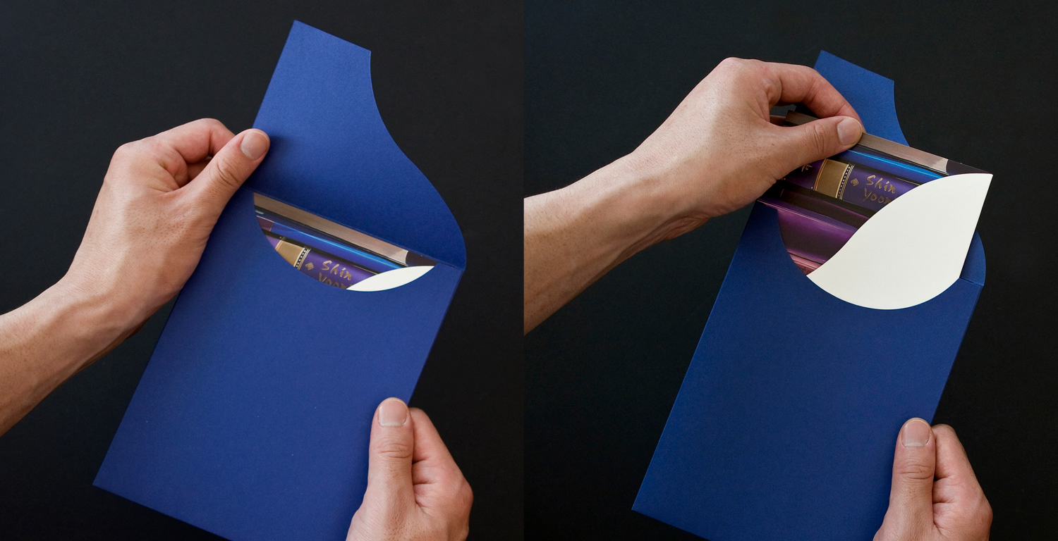
The envelope of the VIP invitation card has a unusual shape. The shape of a flap is following the rule of identity design and the vertical type logo was used to emphasise simplicity. The cover of the card has the same concept. Blue, violet and gold colours deliver the luxurious but fine-cut touches.
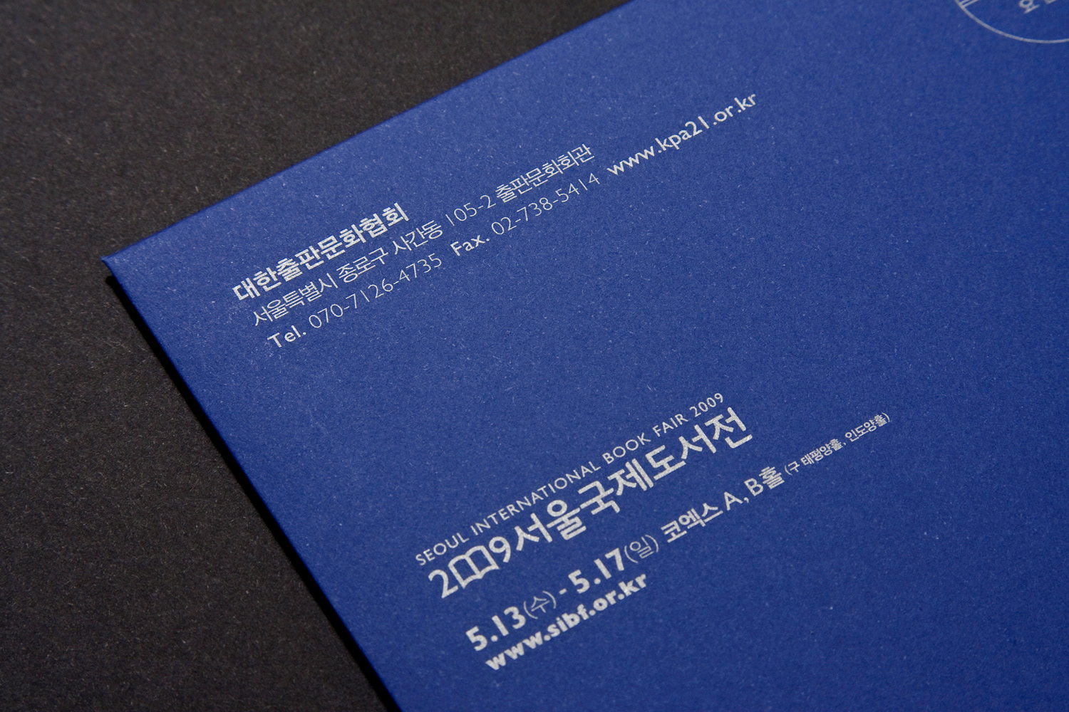
Silver lithography ink on colour paper, Thermography on the card cover
The envelope of the VIP invitation card has a unusual shape. The shape of a flap is following the rule of identity design and the vertical type logo was used to emphasise simplicity. The cover of the card has the same concept. Blue, violet and gold colours deliver the luxurious but fine-cut touches.
Silver lithography ink on colour paper, Thermography on the card cover
Envelope
Invitation Card
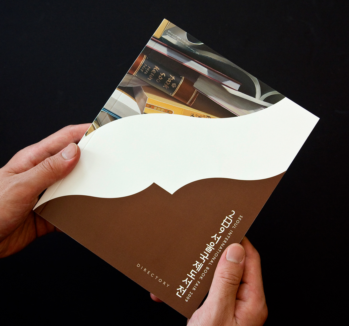
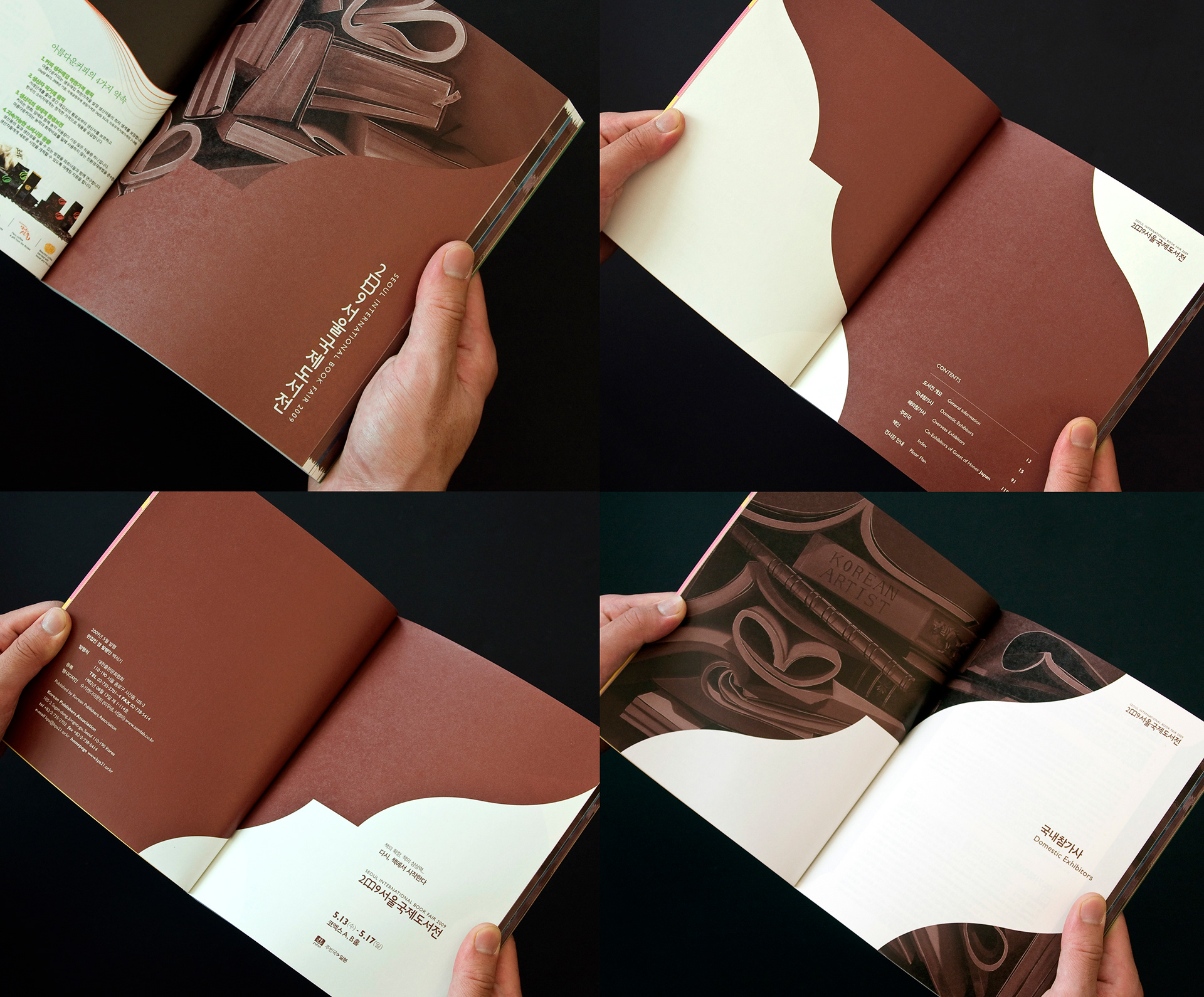
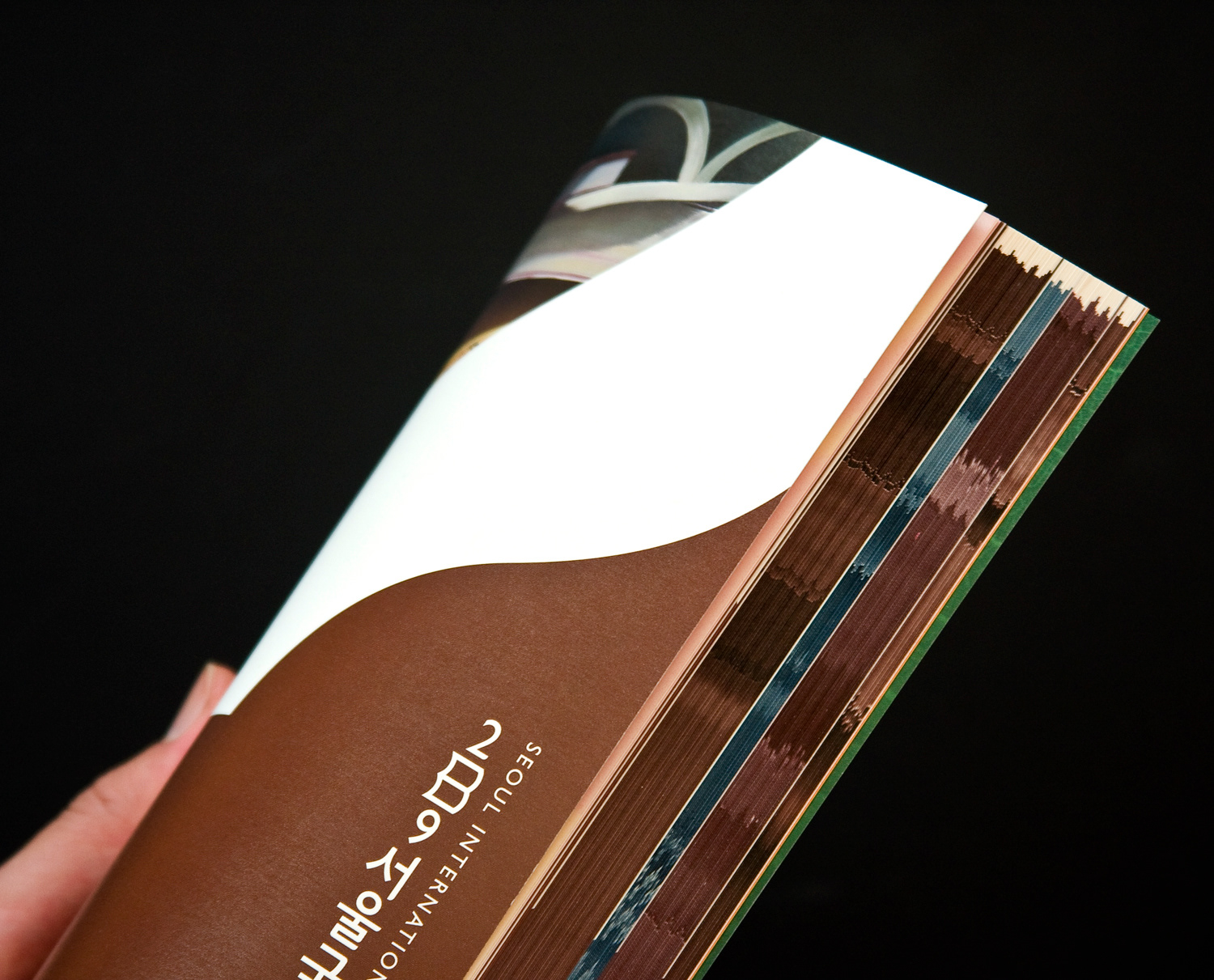
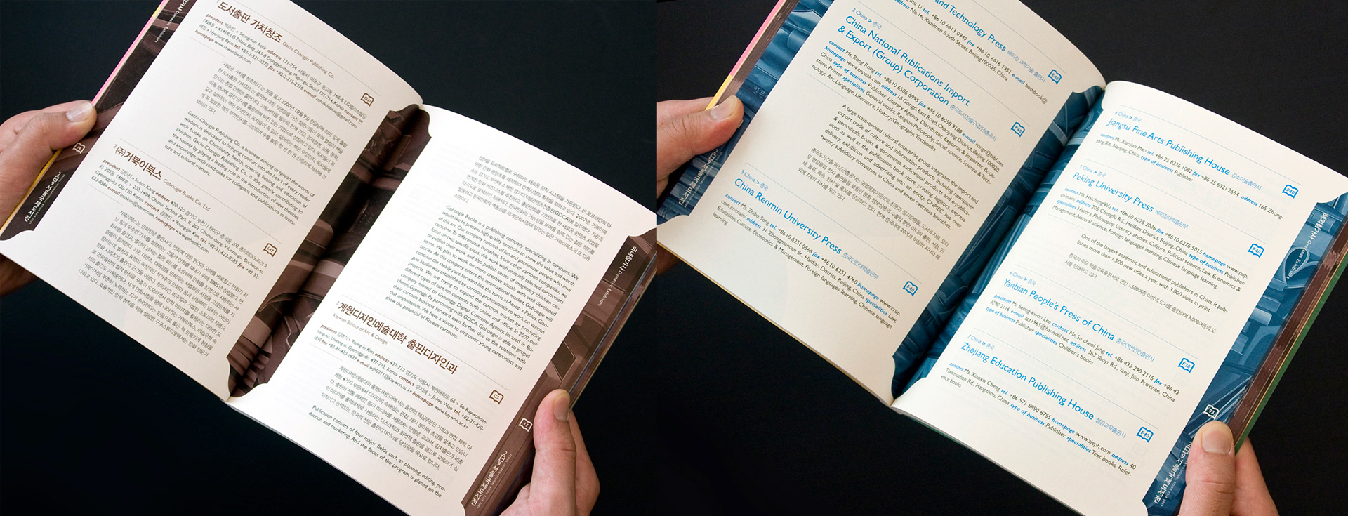
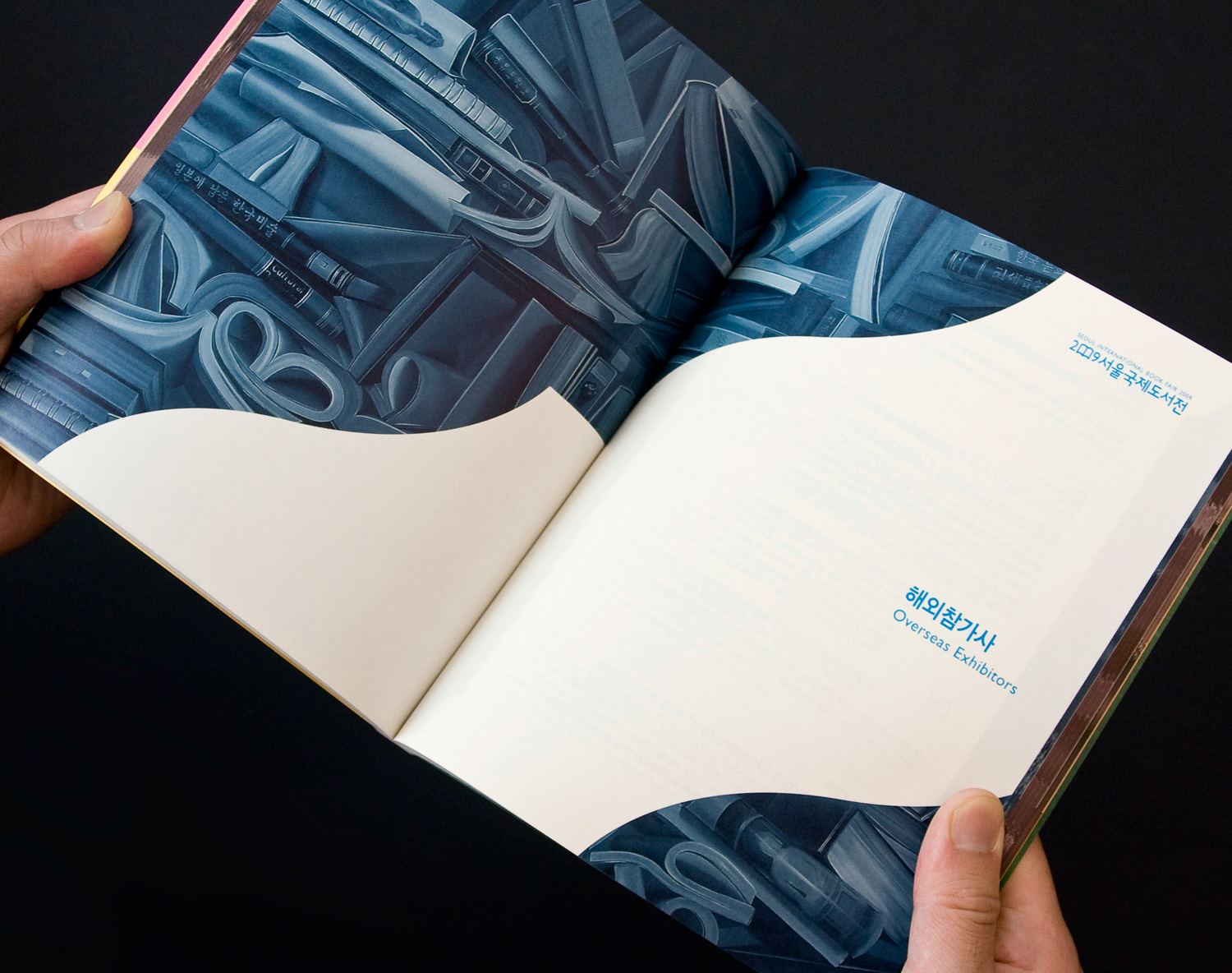
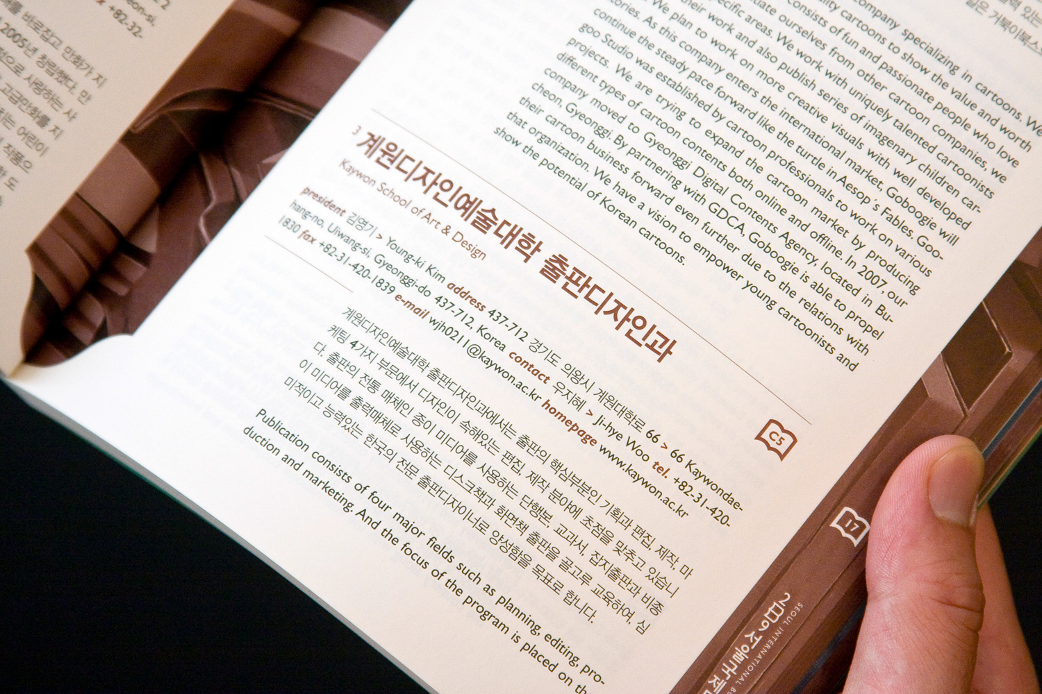
Directory Book
Each section of the book has different colours so that people can easily find a page they want. The directory book contains the information of publishers participating in the fair. The section consists of four sections: Koeran publishers, overseas publishers, the guest country of honor, kids publishes. The design of folios and booth number indexes derive from the main identity concept.
Each section of the book has different colours so that people can easily find a page they want. The directory book contains the information of publishers participating in the fair. The section consists of four sections: Koeran publishers, overseas publishers, the guest country of honor, kids publishes. The design of folios and booth number indexes derive from the main identity concept.
Outside Cover
Application of Graphic Motif
Sectional Colours
Chapter Pages
Icon Design and Details
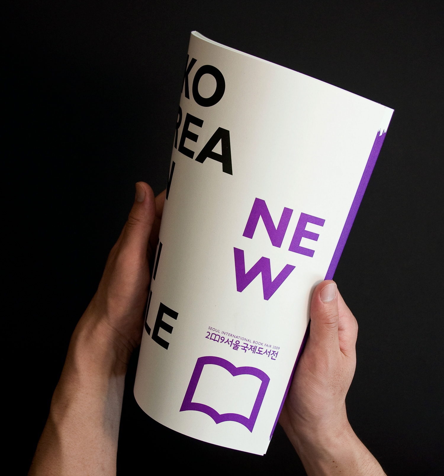
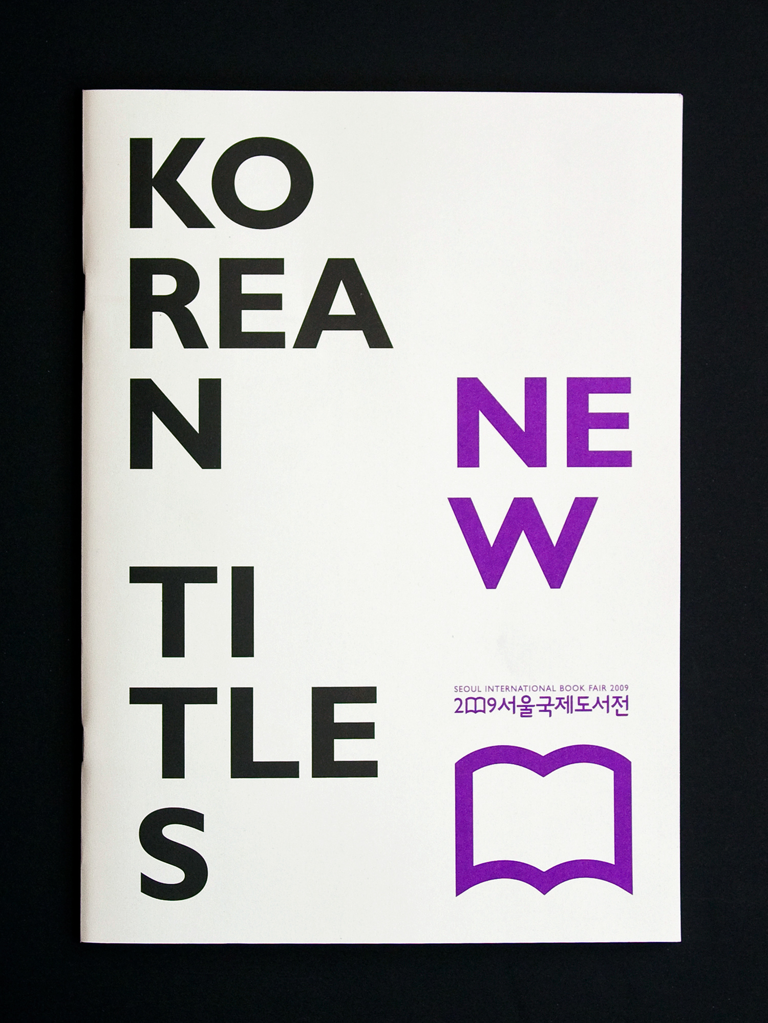
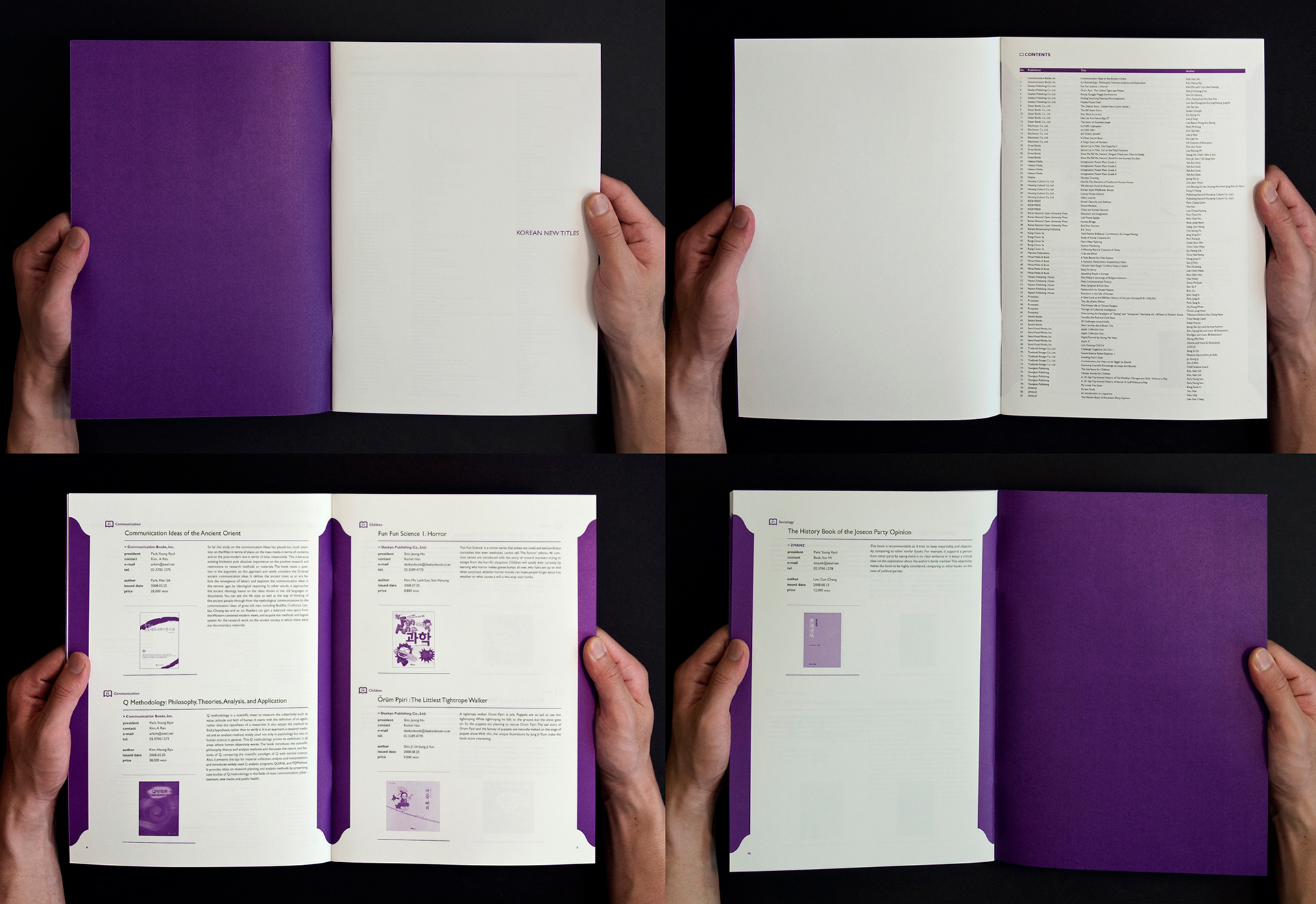
Korean New Titles Catalogue
The catalogue introduces the Korea new titles in 2009. The minimal typographic way was used in duo-tone, black and fluorescent violet. Main book-shaped icon was also used to keep up with other applications.
The catalogue introduces the Korea new titles in 2009. The minimal typographic way was used in duo-tone, black and fluorescent violet. Main book-shaped icon was also used to keep up with other applications.
Outside Cover
Spreads
Programme Leaflet and Floor Plan
Cover
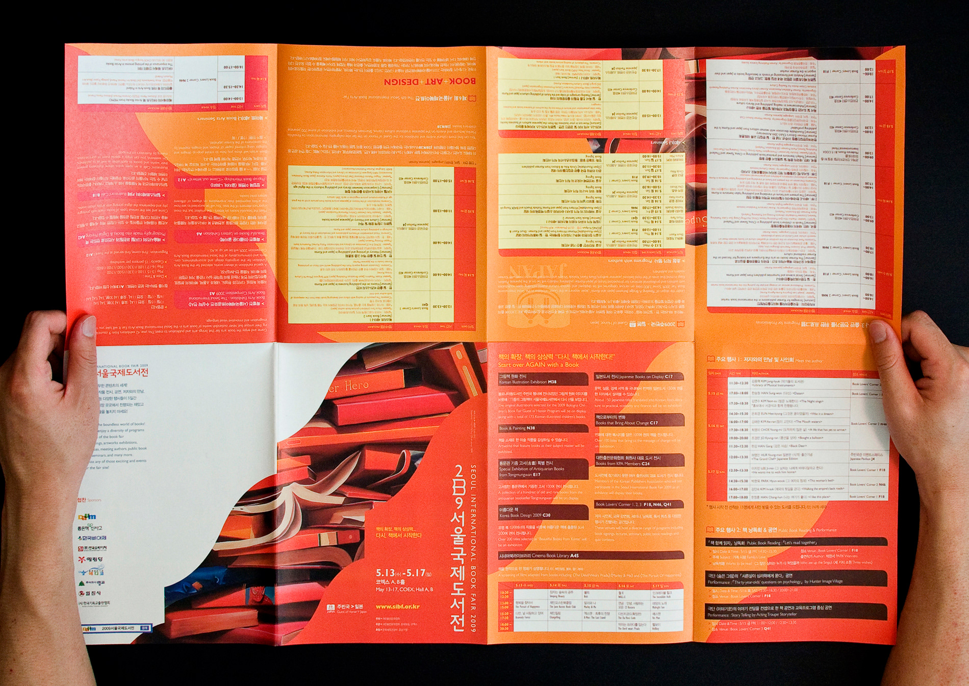
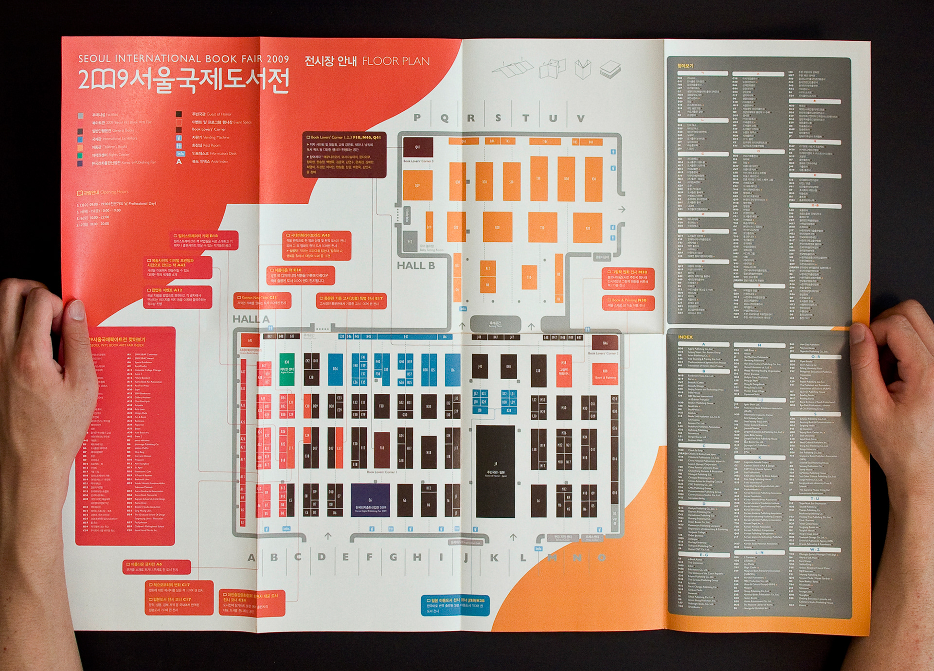
Spread – Map & Event Plans
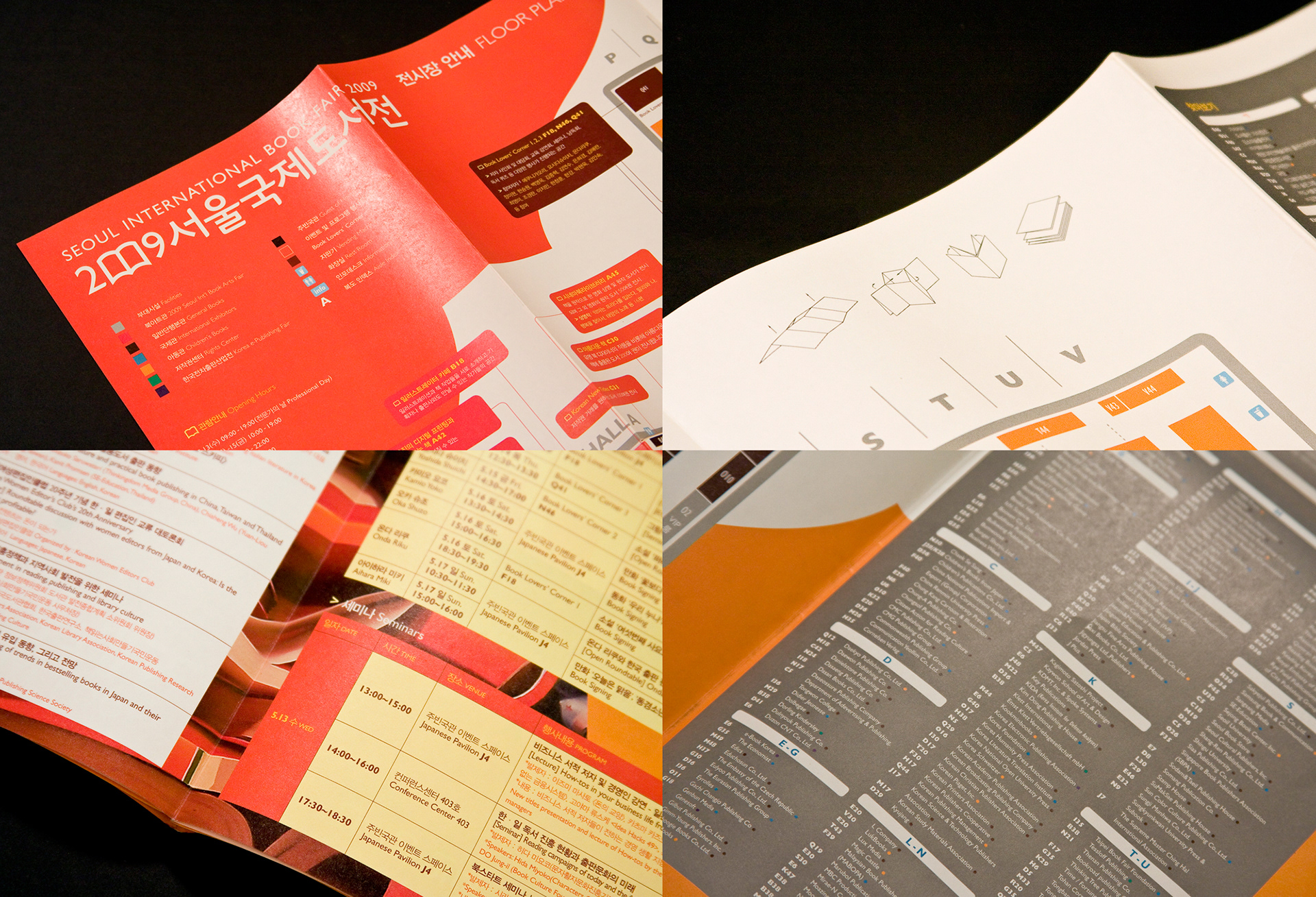
Indexes and Details
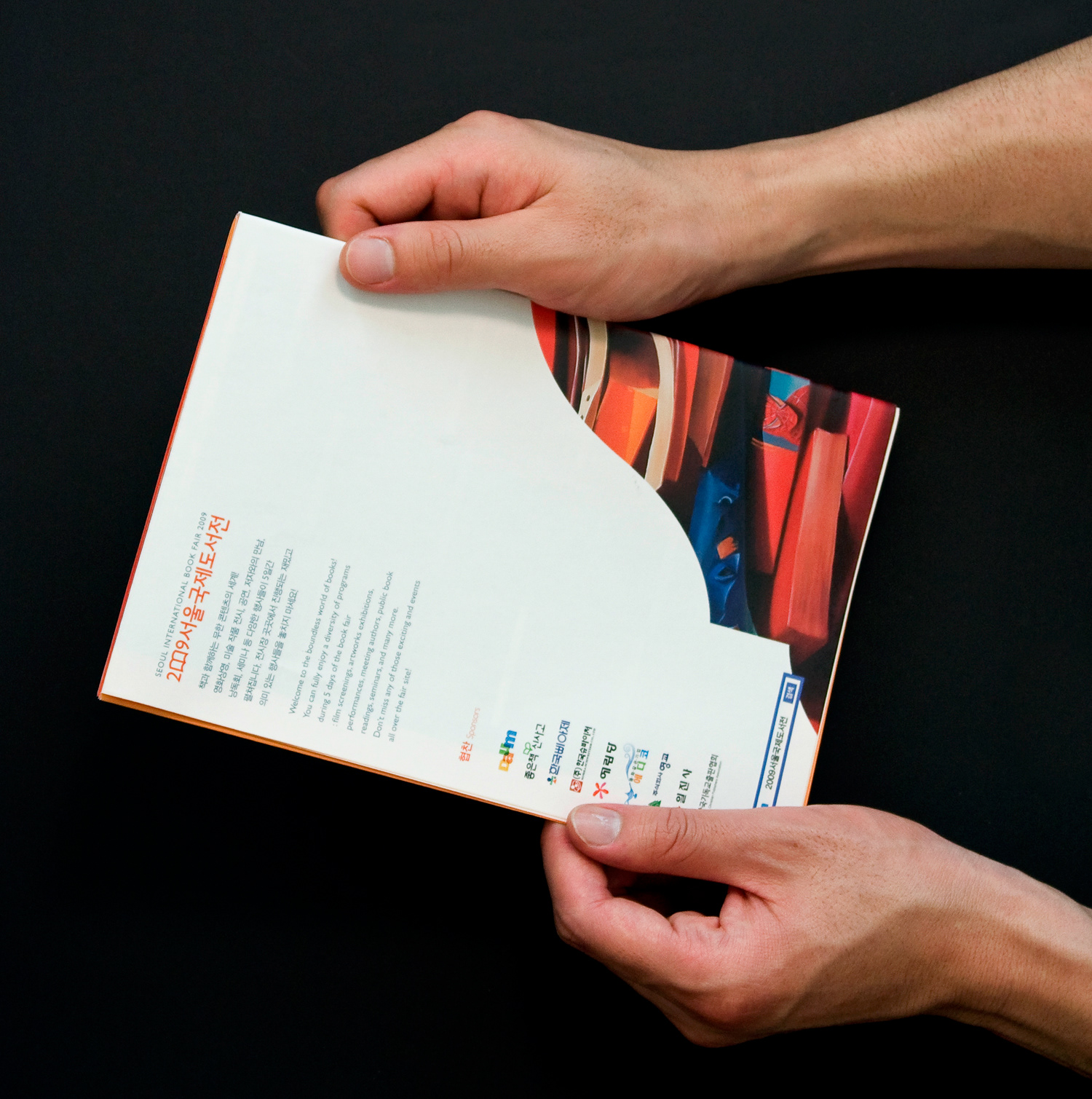
Back
Bookmarks
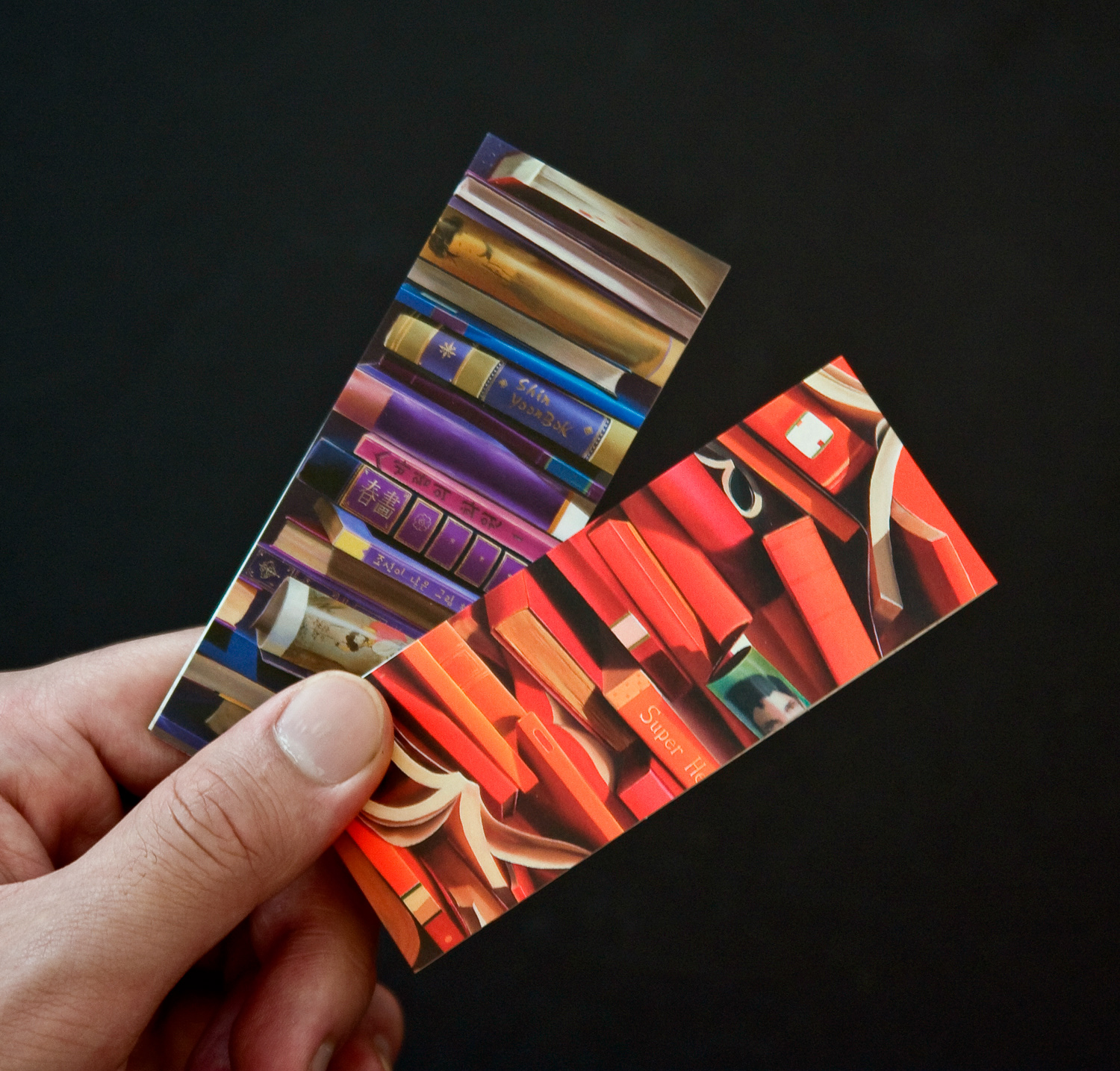
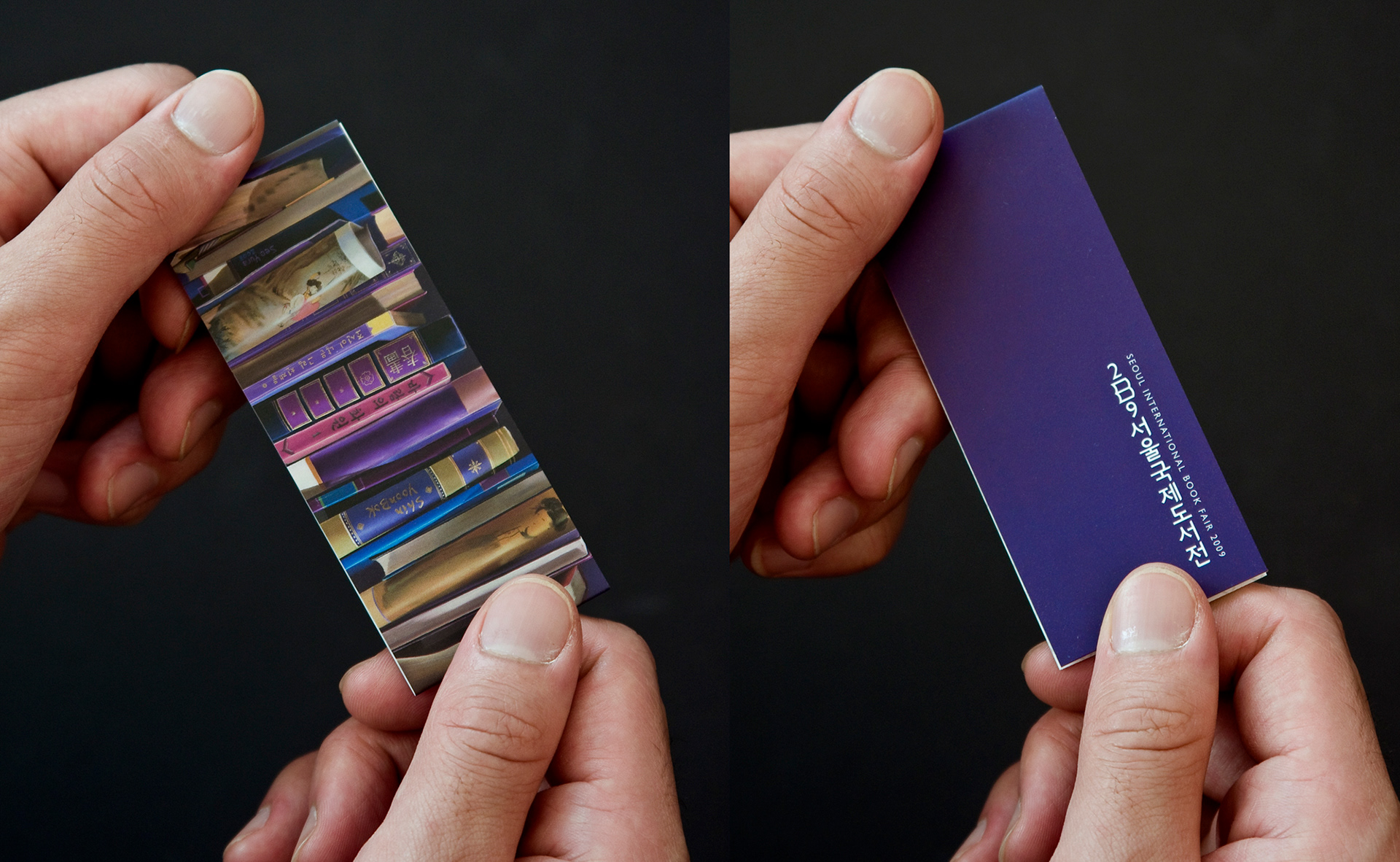
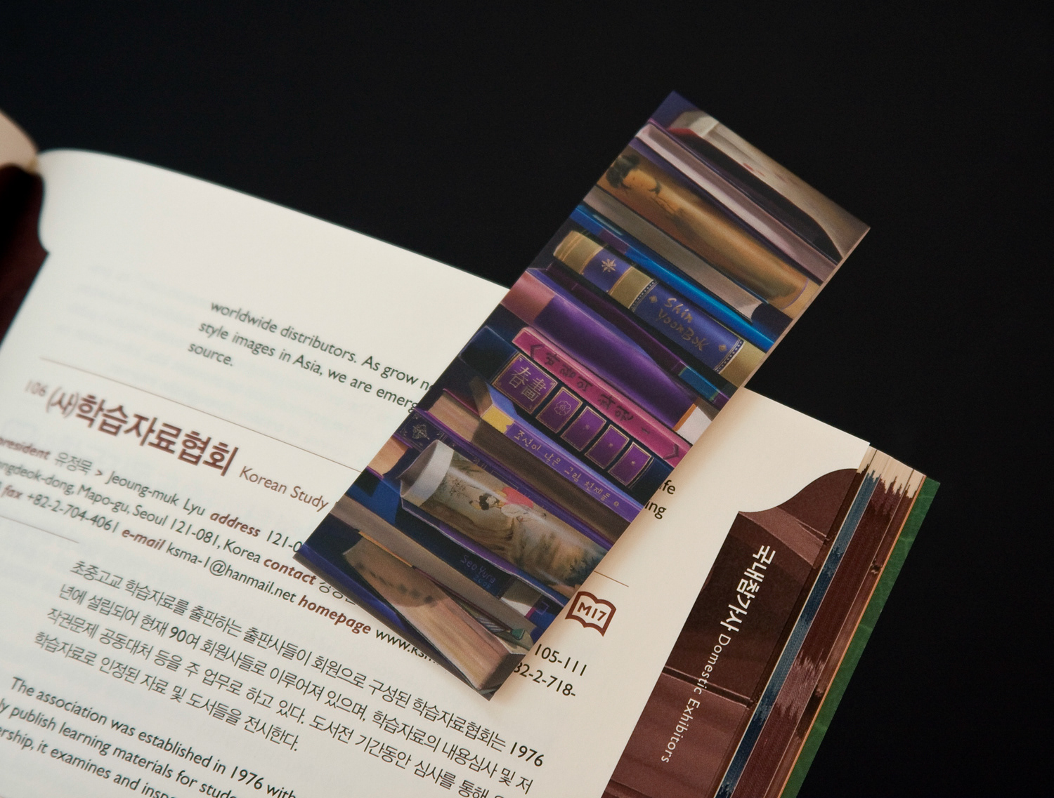
Magnet bookmarks were designed with two colour, scarlet and violet, of which illustration images and tone use. This folded magnet bookmarks were given to people as a souvenir.
Magnet bookmarks were designed with two colour, scarlet and violet, of which illustration images and tone use. This folded magnet bookmarks were given to people as a souvenir.
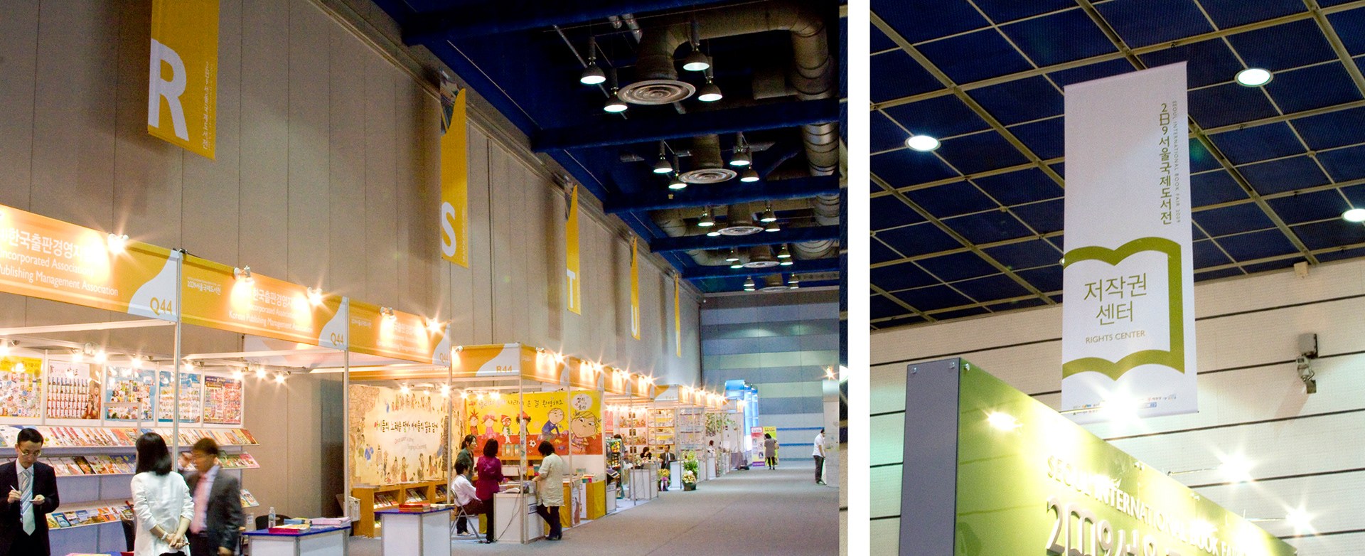
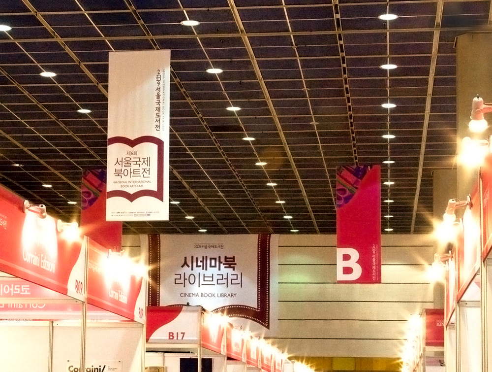
Banners
Banners were planned to section each corner and event area. The colour concept of main banners is scarlet and sky blue as well as posters and other promotional materials. The banners are also following the design motif, the colour concept and the typeface. Sub-colours are supporting the main colours for diversity.
Banners were planned to section each corner and event area. The colour concept of main banners is scarlet and sky blue as well as posters and other promotional materials. The banners are also following the design motif, the colour concept and the typeface. Sub-colours are supporting the main colours for diversity.
Main Entrance
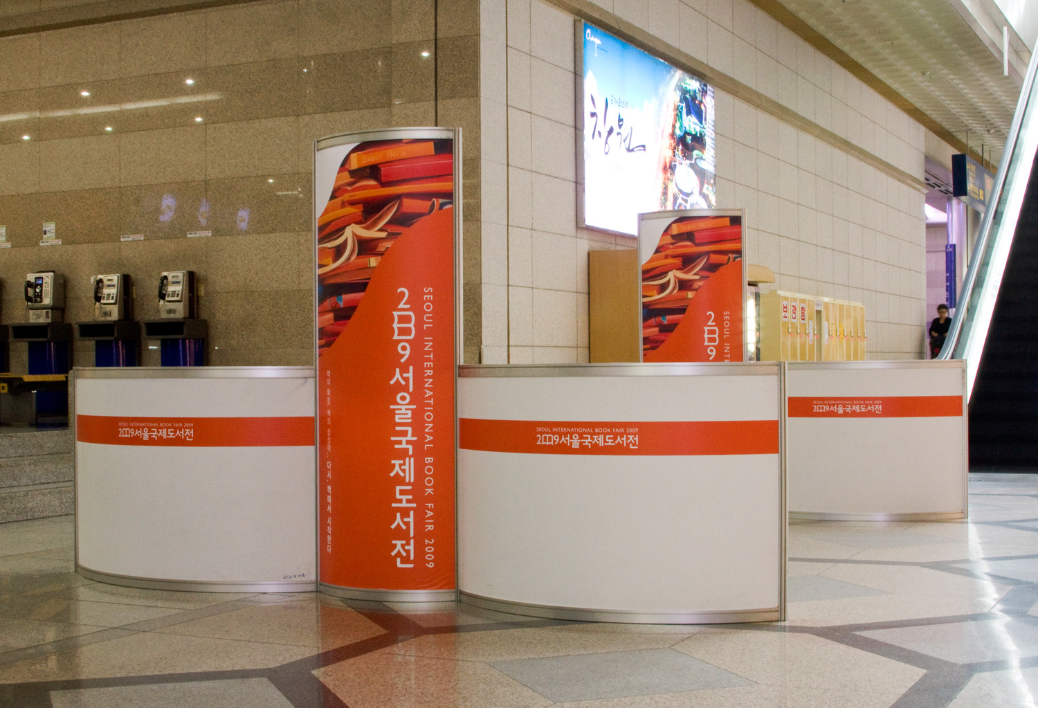
Registration Desk
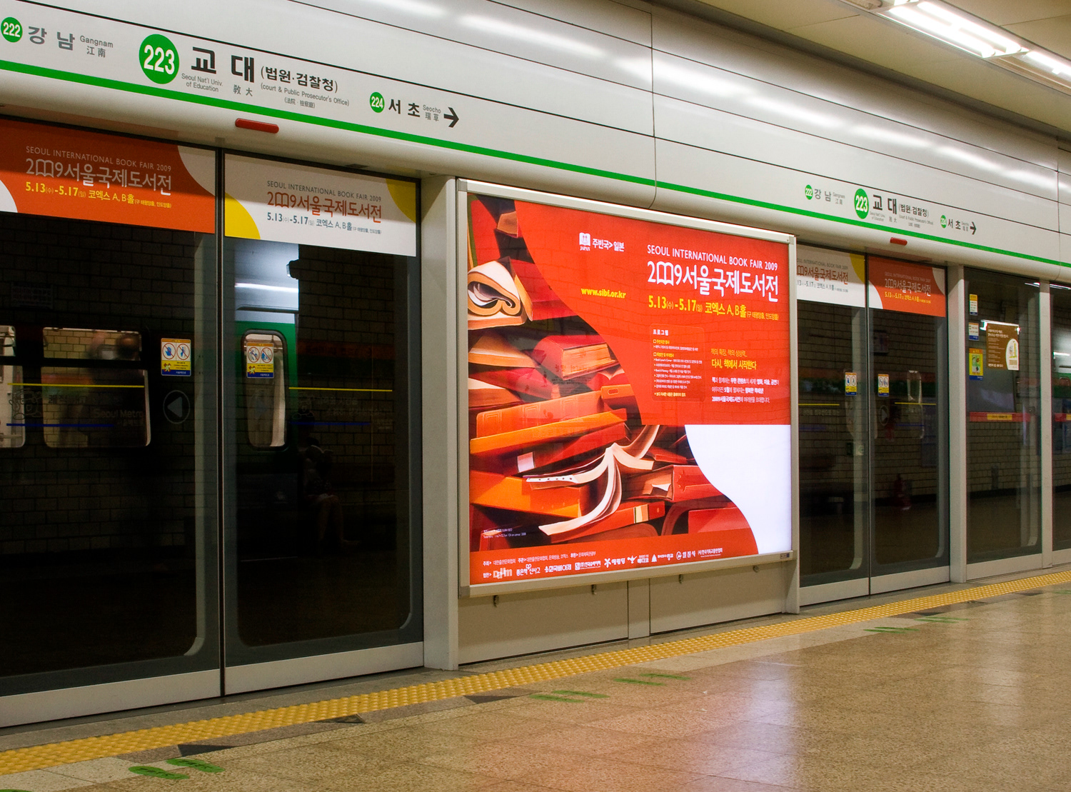
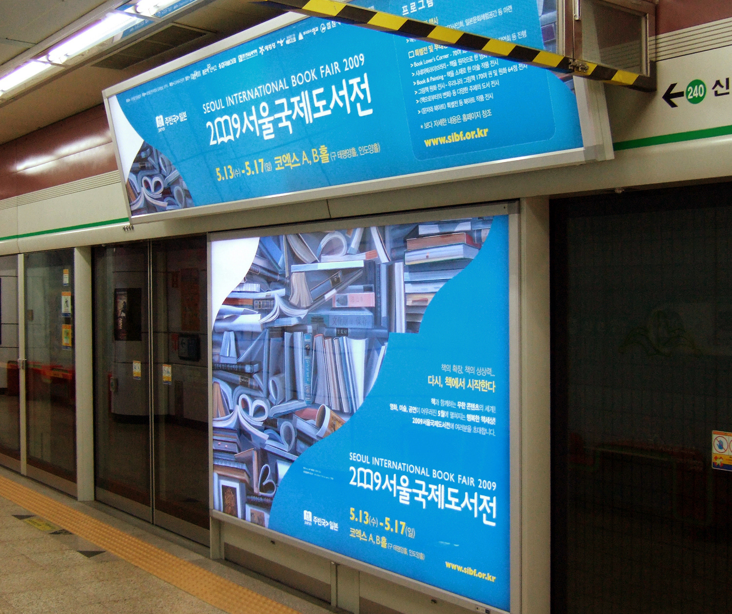
Metro Screen Door Advertisement
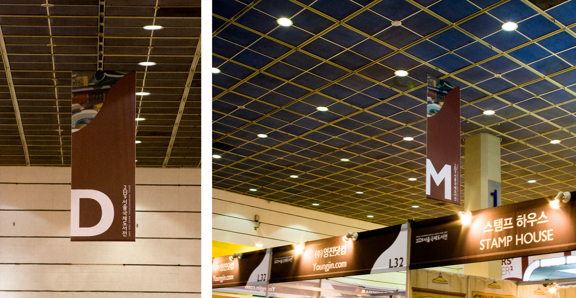
Section Banners
Event banners