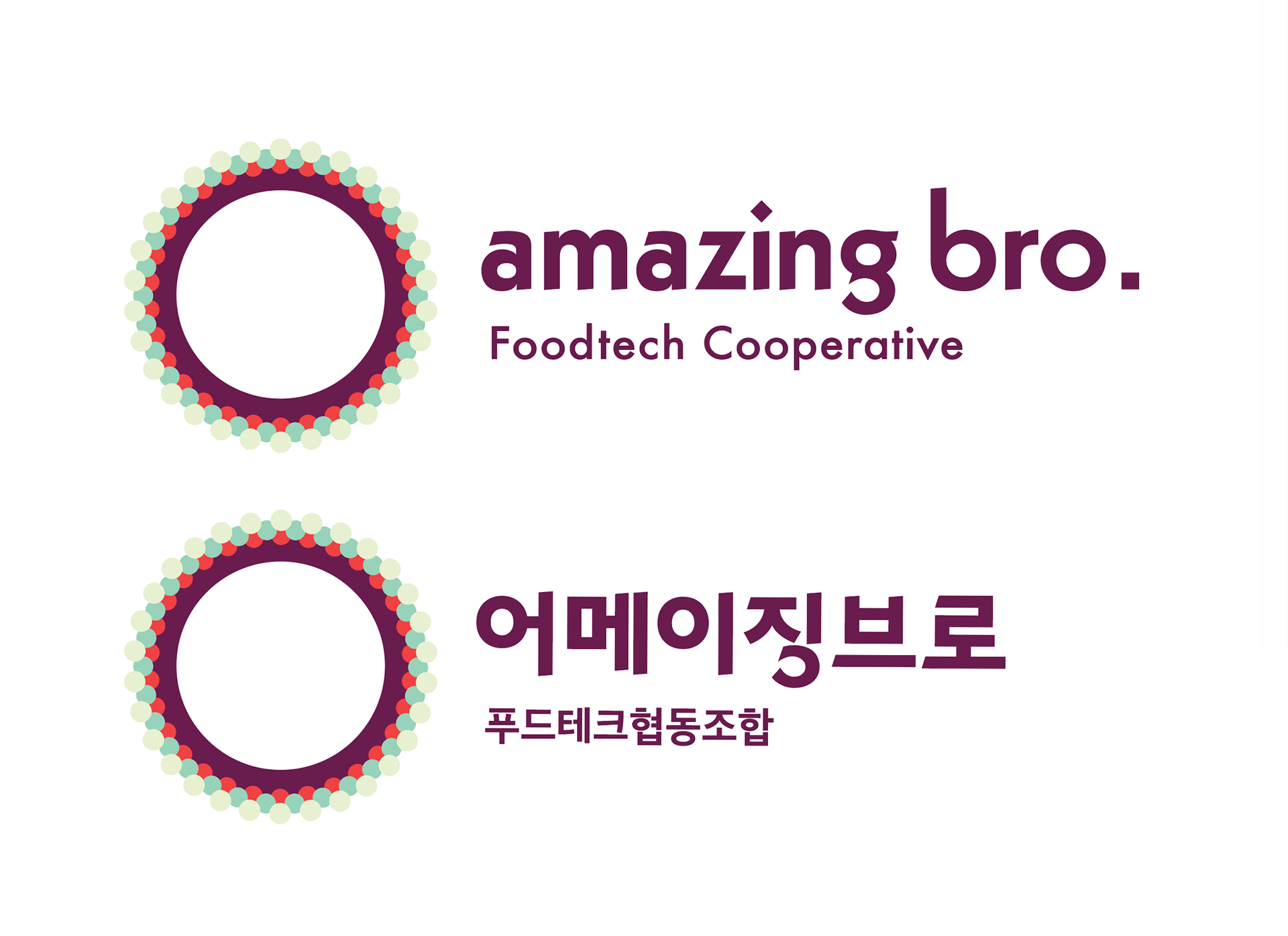
The project involved designing the brand identity for the food-tech cooperative "Amazing Bro." The design features a combination of a symbol and a lettermark, all integrated within a circular shape. The interior of the circle is left blank, allowing for versatile applications, such as in video content or printed on actual plates where food styling can take place inside the circle.
The small circles lining the outer edge of the main circle are reminiscent of the structure of nutrient compounds, with a gradient effect achieved by decreasing the size and darkening the color of the circles towards the center. When viewed from a distance or at a smaller scale, this arrangement gives the impression of a halftone gradient. The color scheme creates a visual blend of purple and mint green through juxtaposition.
For the actual business cards, the central circular part of the design was cut out, enhancing the tactile and visual experience. The concept of "food-tech" was emphasized more on the technology aspect rather than just food, hence geometric shapes and graphic motifs were used to convey this message. The circular form also represents the unique cooperative structure of the organization.

