
Client | Korean Publishers Association 대한출판문화협회
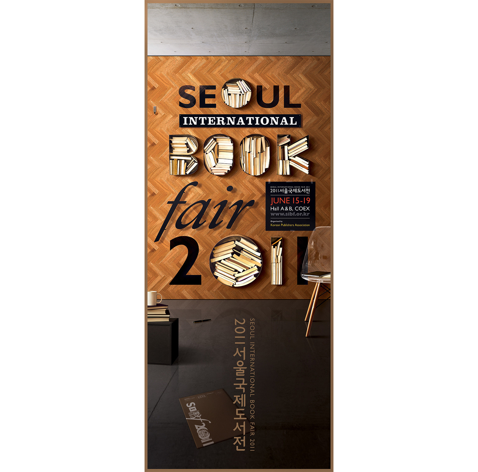
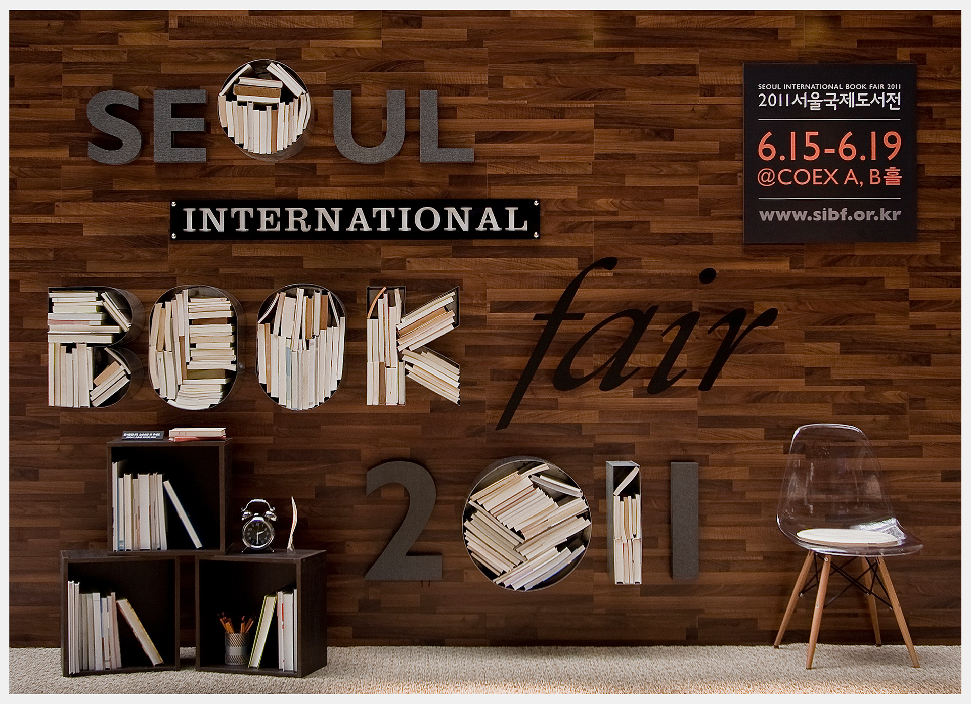
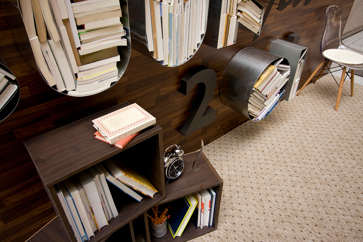
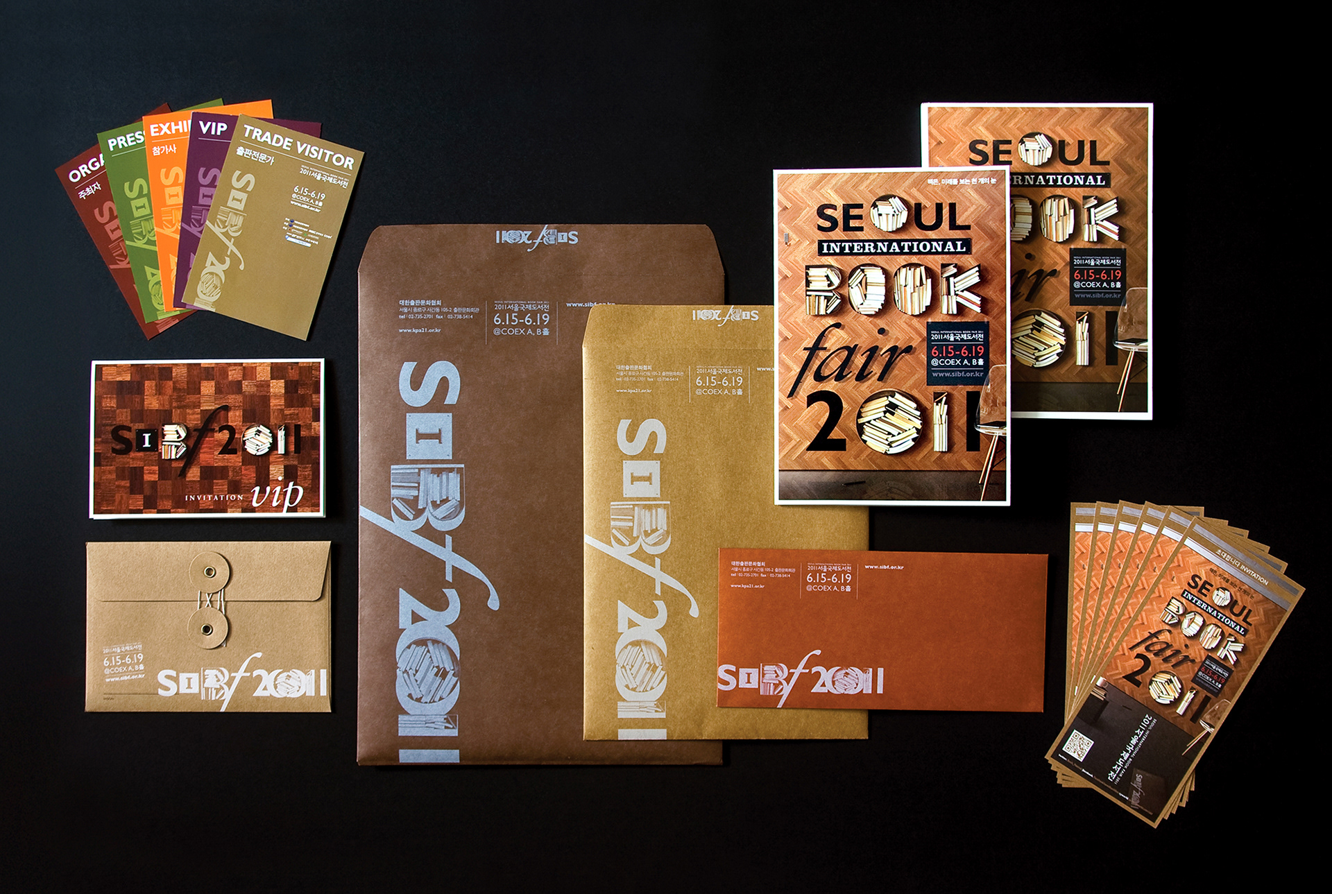
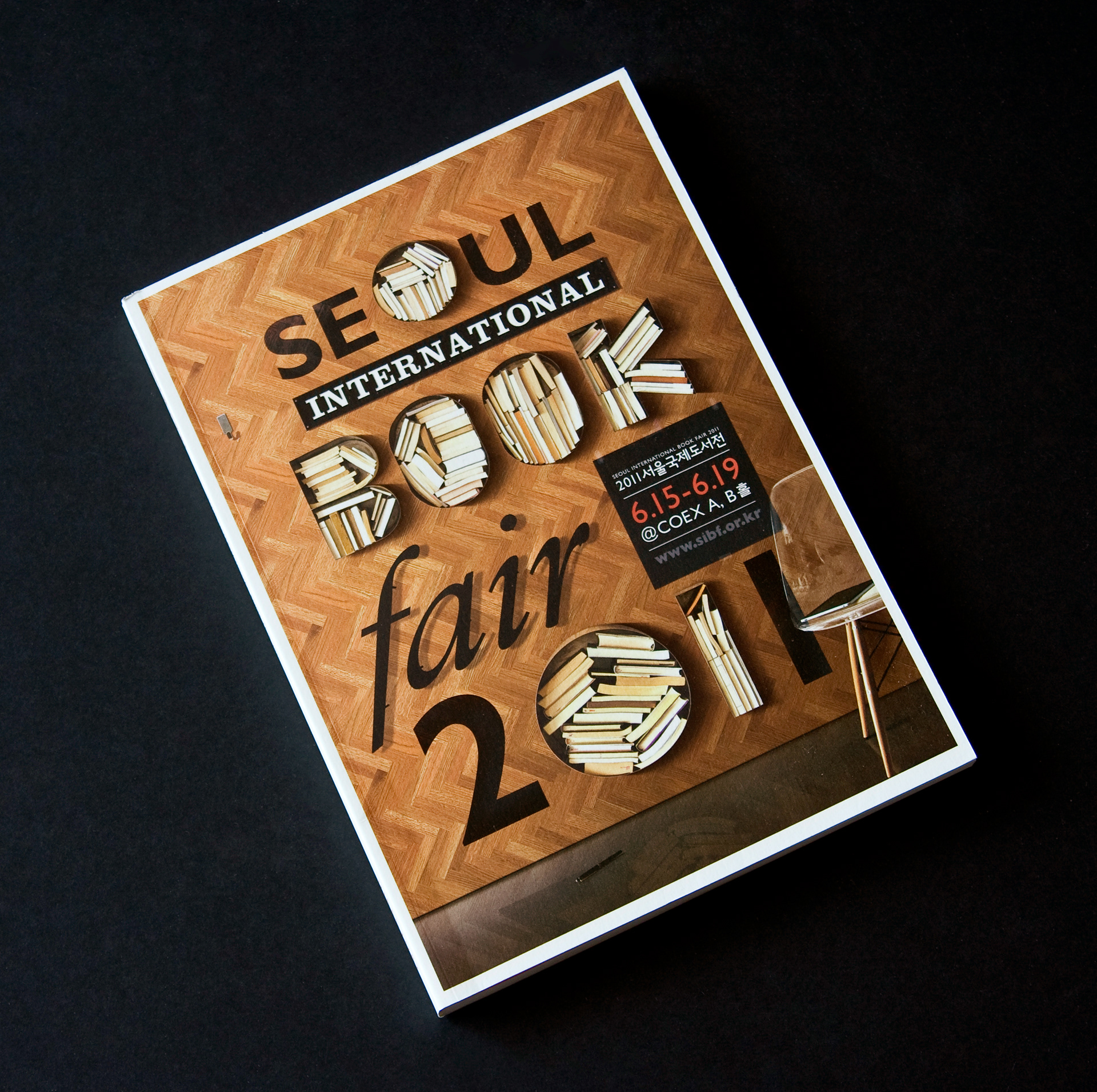
This project is an identity design of Seoul International Book Fair 2011, ranging from poster to small applications. I have been art-directing this event for 4 years, except for only 2010, when I was away to Australia for 6 months. The book fair took place at COEX(Convention and Exhibition Centre, World Trade Centre) as usual. The design concept was very straightforward and simple, since the target audience of the event ranges all age group in any kind of field, anyone interested in a book, even ane-book. In the beginning, there were a few more prototypes, but the client along with the market researchers liked this concept. "Books in a Type, Typo-bookshelf", this is the easiest way to appeal people. In addition, in this digital age, using real books has not only aesthetic meaning but it also convey a message of the wellness of print media. I used a typographic method to realise the concept and, in the end, the installation that I made for a poster image was installed in front of the main entrance.
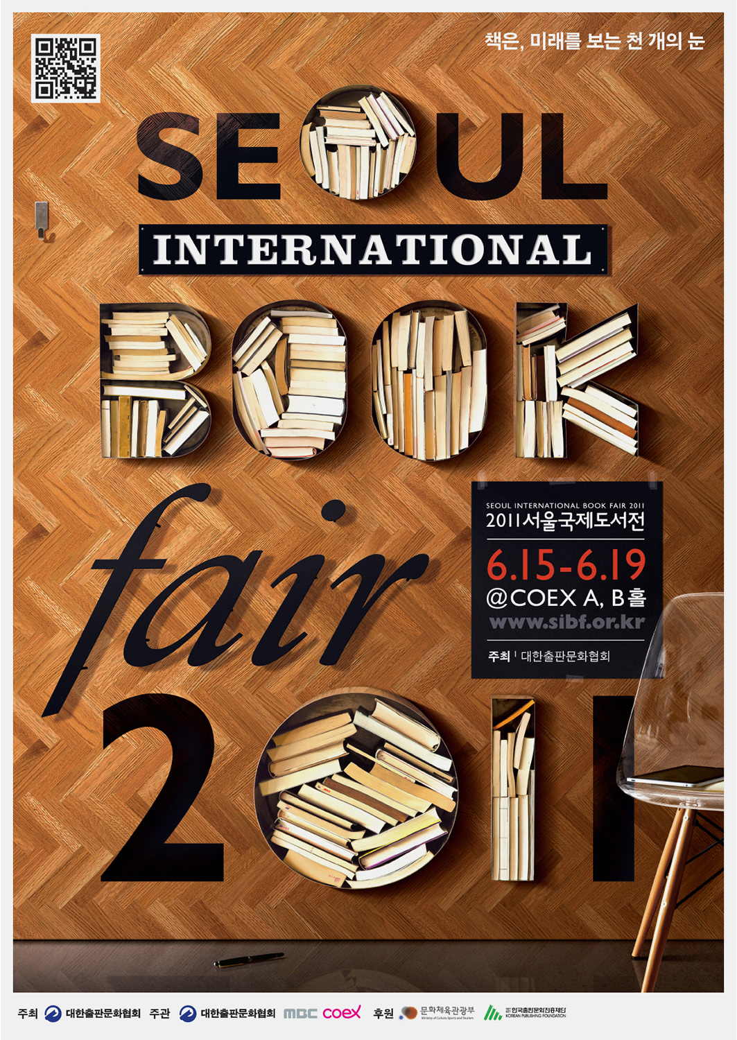
Main Poster
All objects are real and set up on a herringbone wood tiles. There were some inner arguments with the choice of the pattern, however the herringbone pattern was eventually chosen because the shape looks like a book. This kicked off the use of diverse wood patterns to other design applications, which distinct each media and sections in a hall.
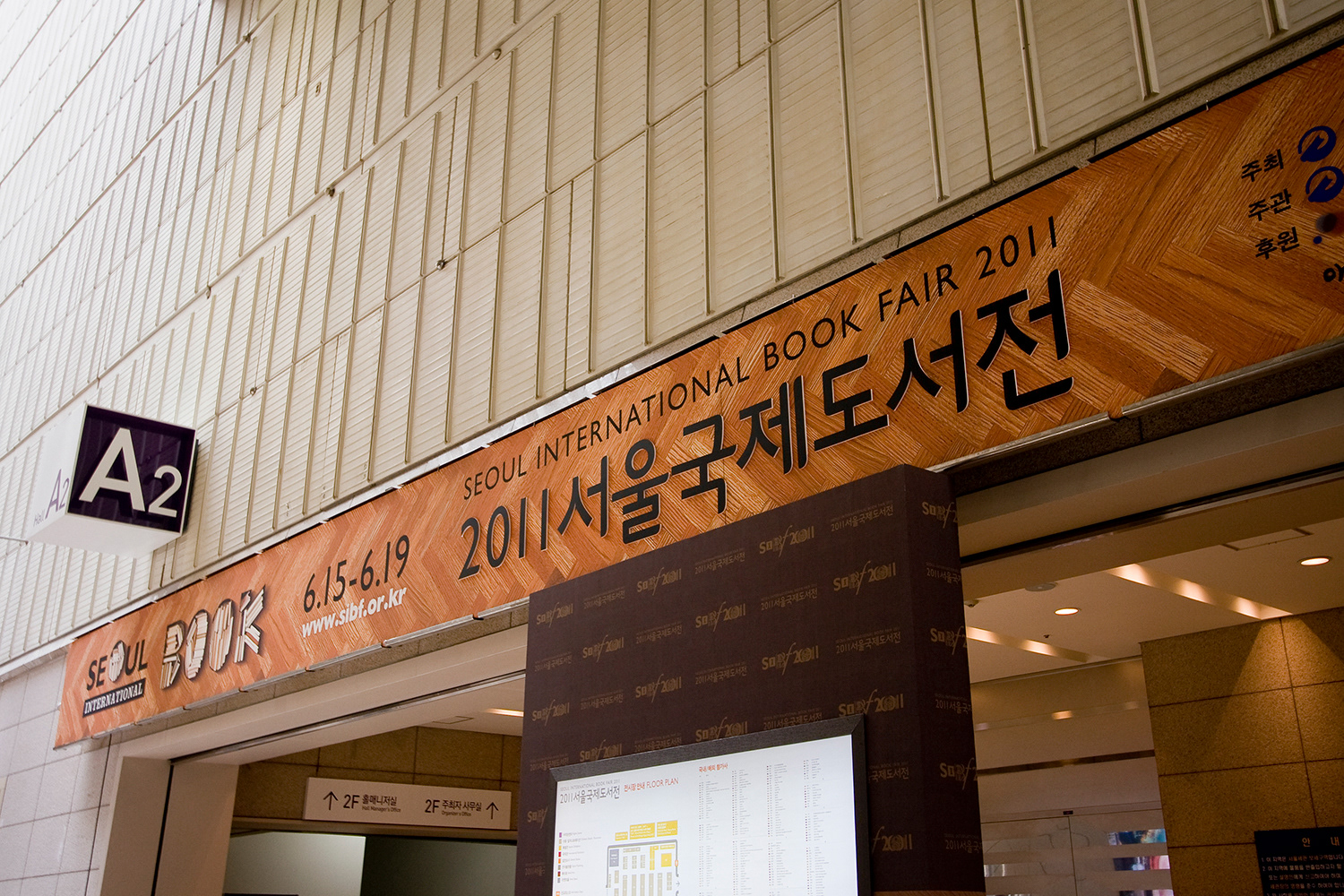
Main Entrance Sign
Sub-Logo
The main logo and graphic motif was pretty complex. So, I made one more monotone sub-logo, which could be used conveniently in any kind of context. Main concept was kept and the same fonts used in the poster were extracted and re-composed in the logo. A key colour was designated with metalic gold.
The main logo and graphic motif was pretty complex. So, I made one more monotone sub-logo, which could be used conveniently in any kind of context. Main concept was kept and the same fonts used in the poster were extracted and re-composed in the logo. A key colour was designated with metalic gold.

Graphic Motif
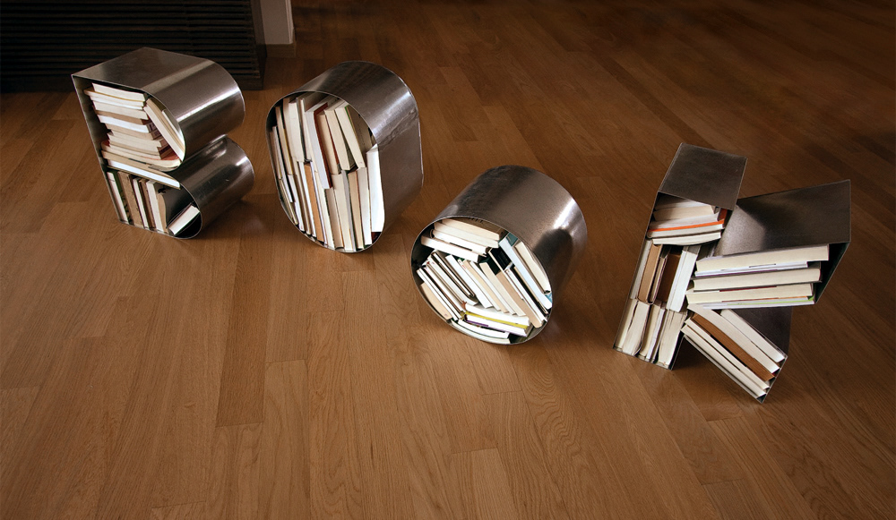
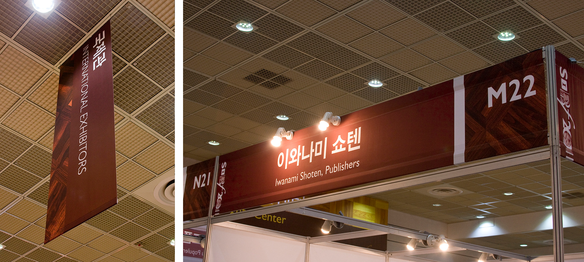
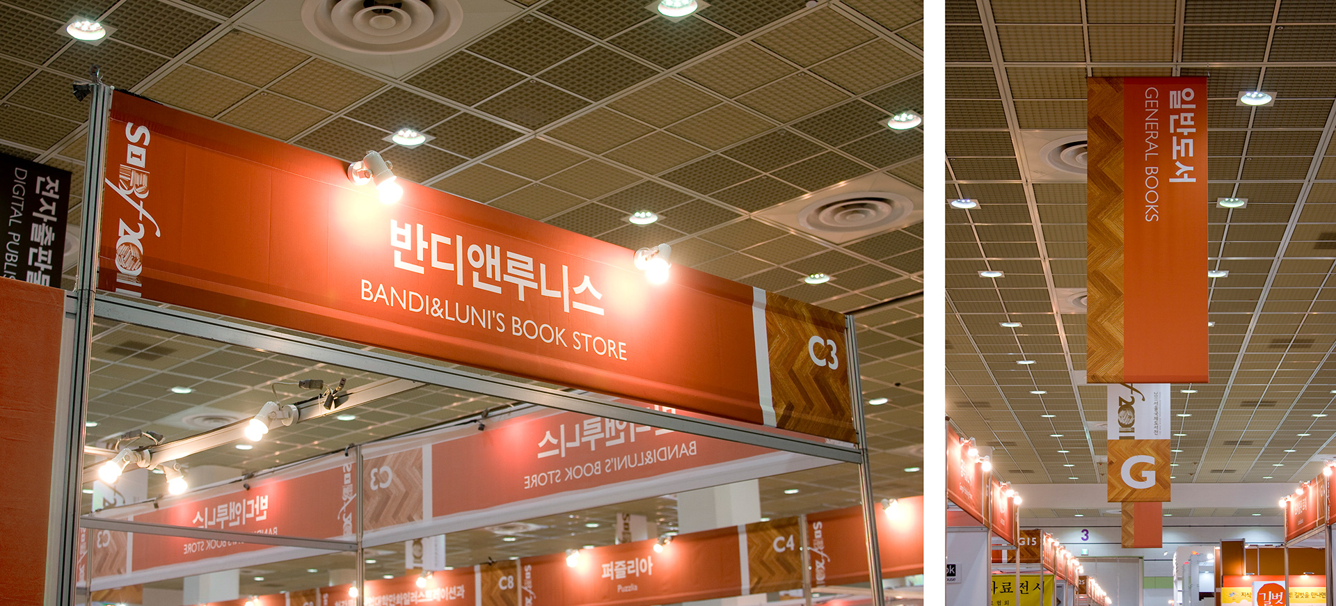
When it comes to an identity design, traditionally, vector graphic images are commonly used to facilitate the application and variation, and this project suggested the new way of application in identity design domain. The process of variation was really hard because we had to change all the lights and shadows depending on a size and a format of media.
When it comes to an identity design, traditionally, vector graphic images are commonly used to facilitate the application and variation, and this project suggested the new way of application in identity design domain. The process of variation was really hard because we had to change all the lights and shadows depending on a size and a format of media.
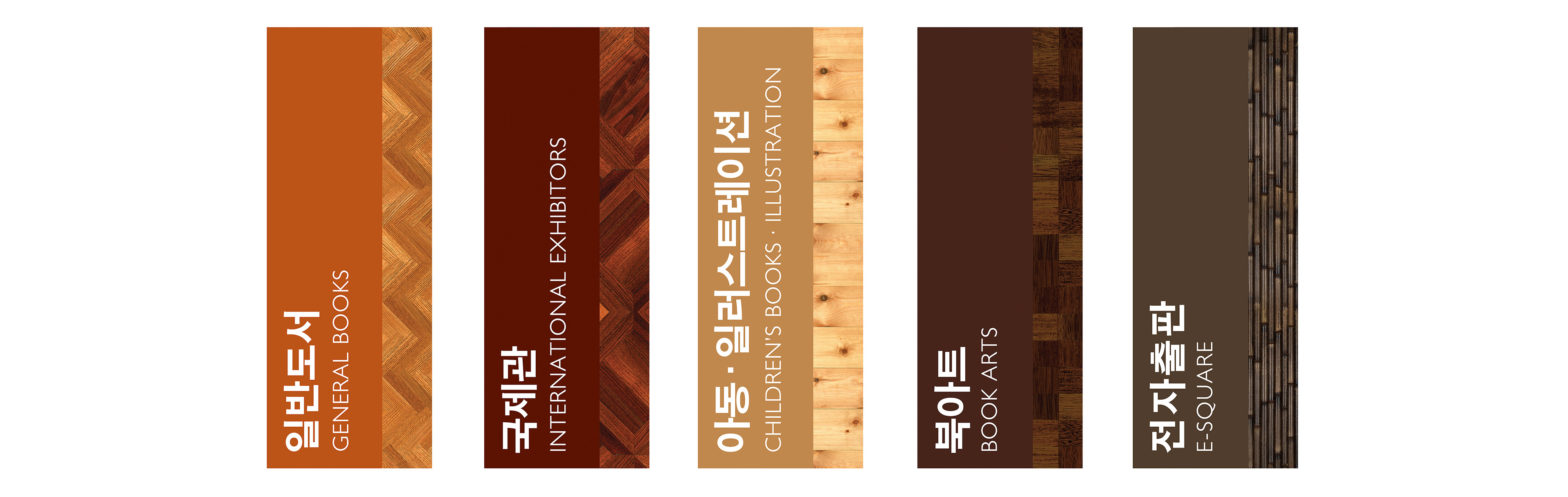
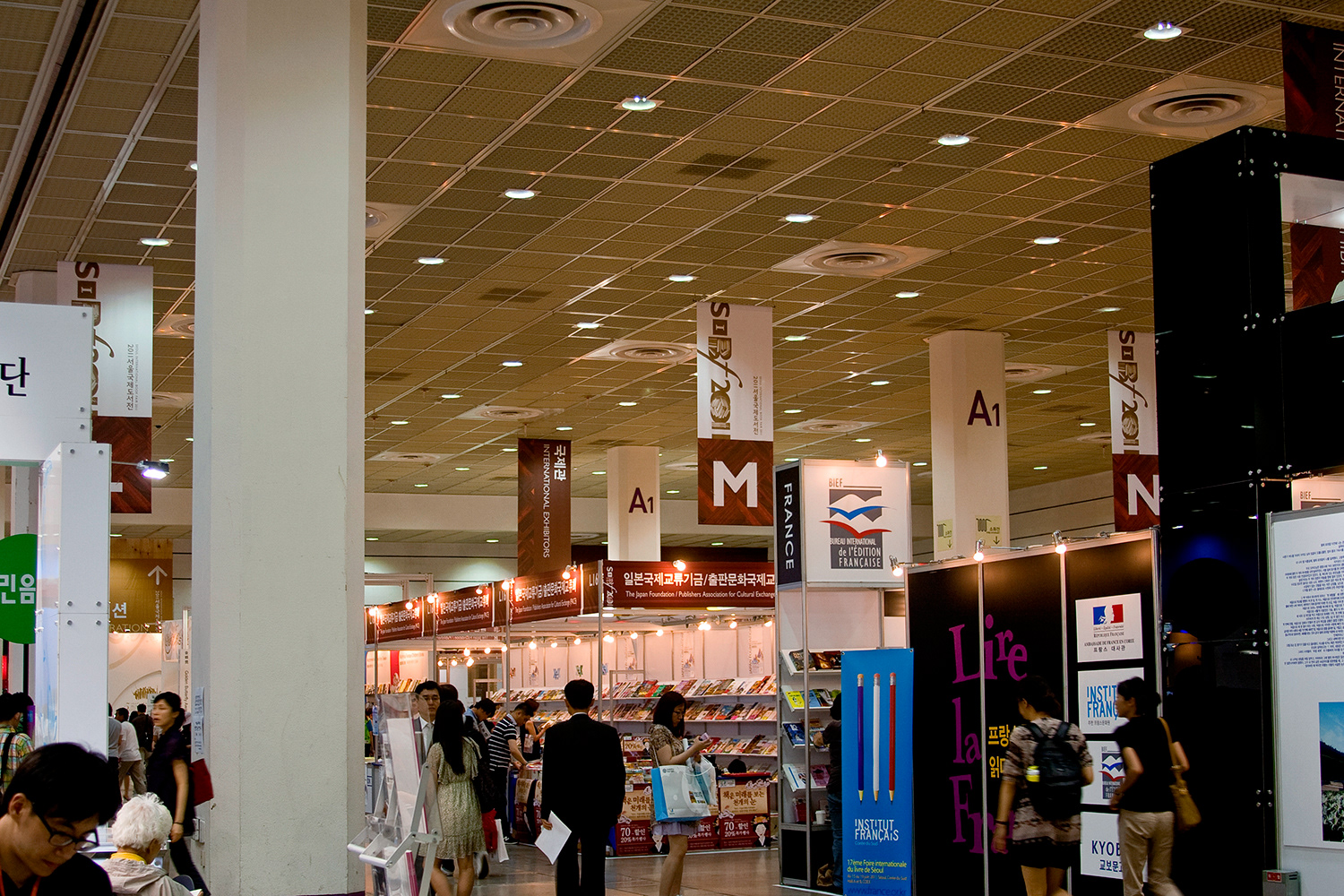
Section Banners

Aisle Banners
Variation
This is a 1✕2.5 ratio image. Because the poster image is a photograph, I had to make a lot of efforts to variate the image in accordance with diverse formats. However, making a ceiling and a bottom, arranging objects was very enjoyable. This banner was hung up in the Korean booth in the Frankfurt Book Fair 2011.
This is a 1✕2.5 ratio image. Because the poster image is a photograph, I had to make a lot of efforts to variate the image in accordance with diverse formats. However, making a ceiling and a bottom, arranging objects was very enjoyable. This banner was hung up in the Korean booth in the Frankfurt Book Fair 2011.
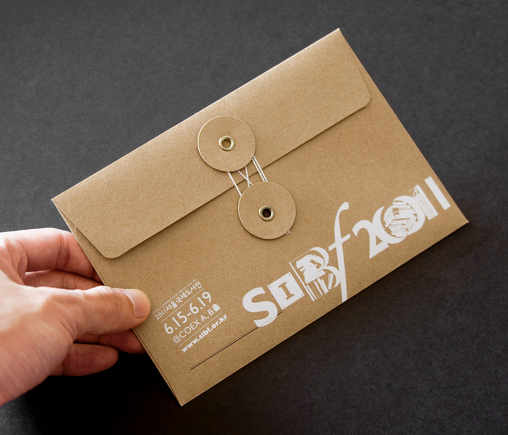
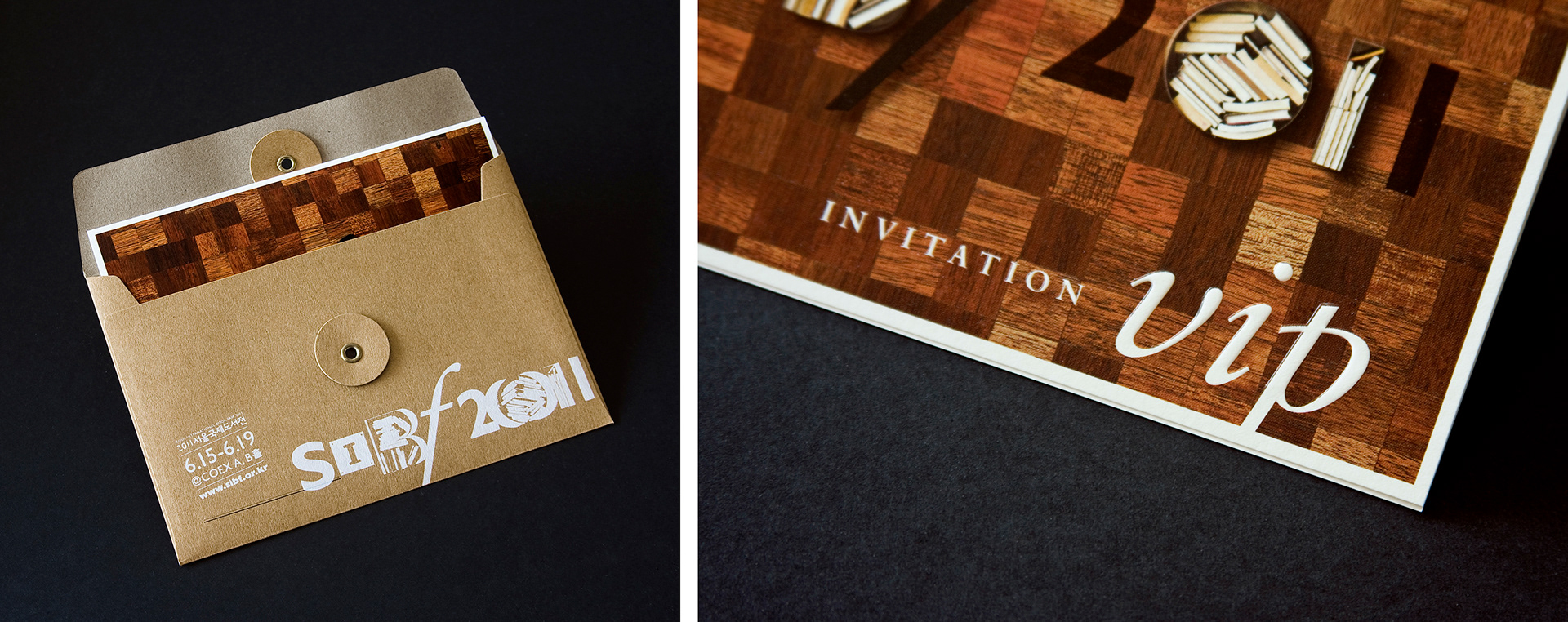
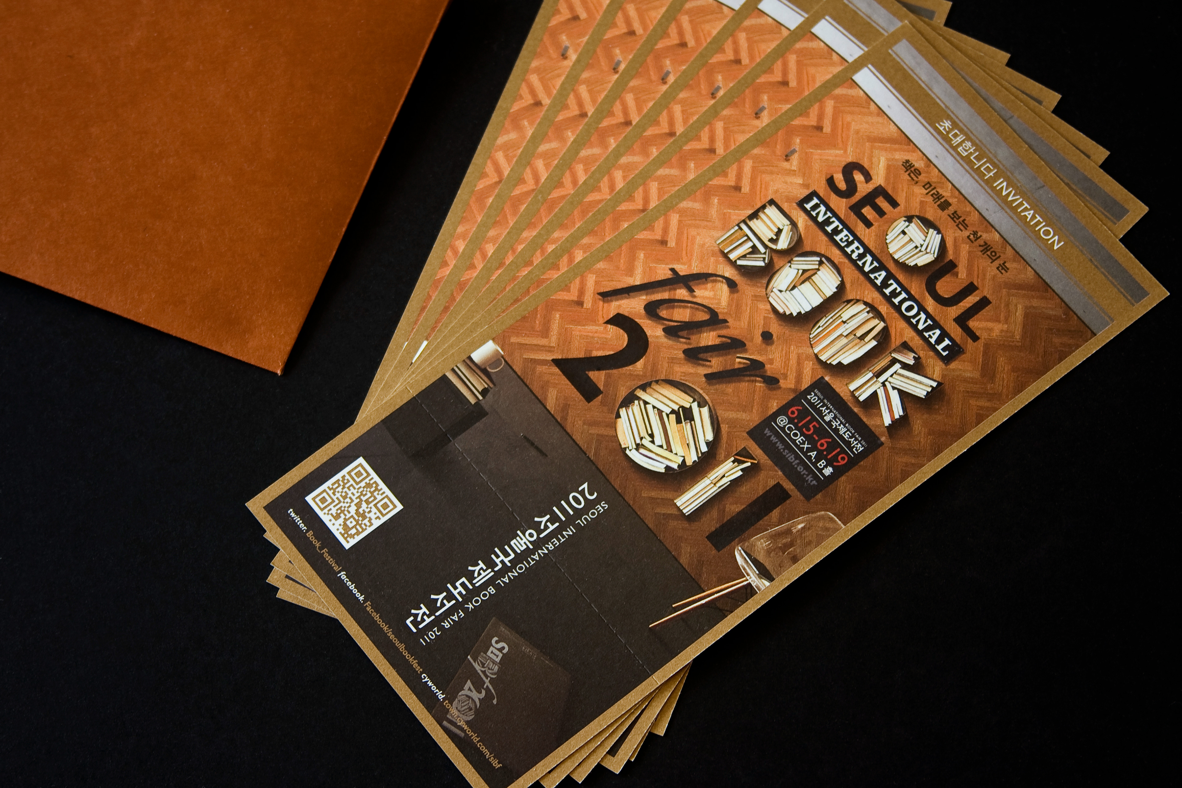
VIP Invitation Card & Envelope
A checked Merbau wood was used in VIP invitation card due to the beautiful red colours and contrast. Sub-logo was applied to the cover image and letters on the cover was embossed. The rough craft paper envelope was bound with thread and the logo of the fair was screen printed on it.
A checked Merbau wood was used in VIP invitation card due to the beautiful red colours and contrast. Sub-logo was applied to the cover image and letters on the cover was embossed. The rough craft paper envelope was bound with thread and the logo of the fair was screen printed on it.
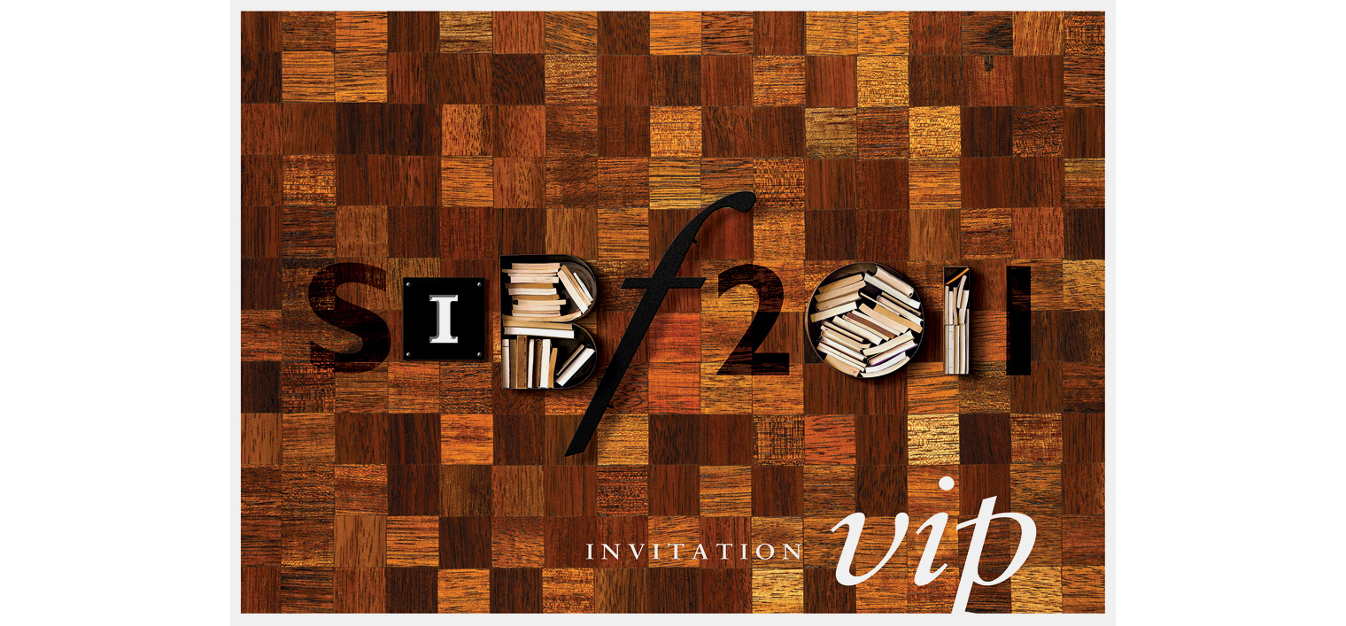
VIP Invitation Card Cover
Installation
The images of the main poster was realised in front of the main entrance, so that people took a photo and had a good memory of the event. The objects that were manufactured for the poster were re-assembled into the wood panel. The mood of the installation reflects the trend of book cafe in Korea.
The images of the main poster was realised in front of the main entrance, so that people took a photo and had a good memory of the event. The objects that were manufactured for the poster were re-assembled into the wood panel. The mood of the installation reflects the trend of book cafe in Korea.
Print Applications
All printing materials were designed such as leaflets, tickets, directory books, envelopes and tags. The graphic motif was applied to the all applications and the patterns were also used to deliver the coherent visual images.
All printing materials were designed such as leaflets, tickets, directory books, envelopes and tags. The graphic motif was applied to the all applications and the patterns were also used to deliver the coherent visual images.
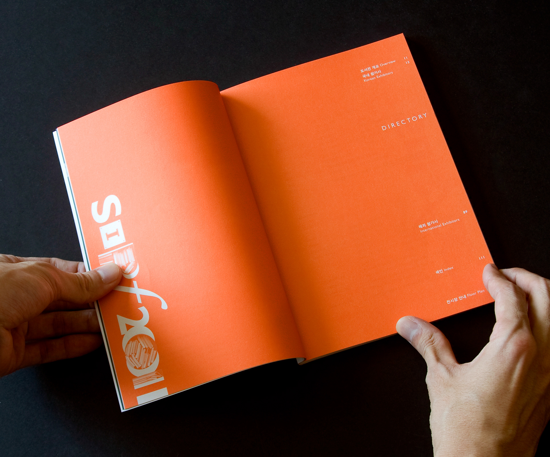
Duo-tone Printing, Directory Book
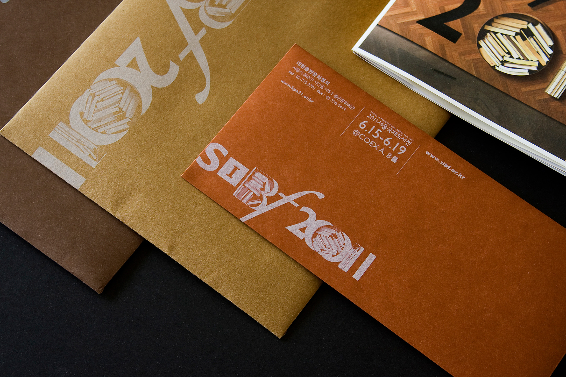
UV Lithography on Craft Paper
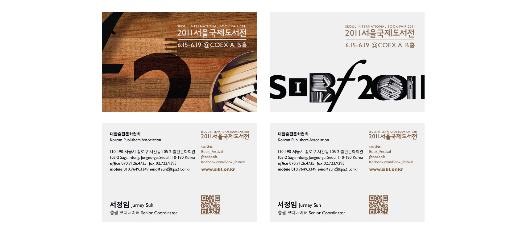
Business Cards
Tickets
Banners & Signs
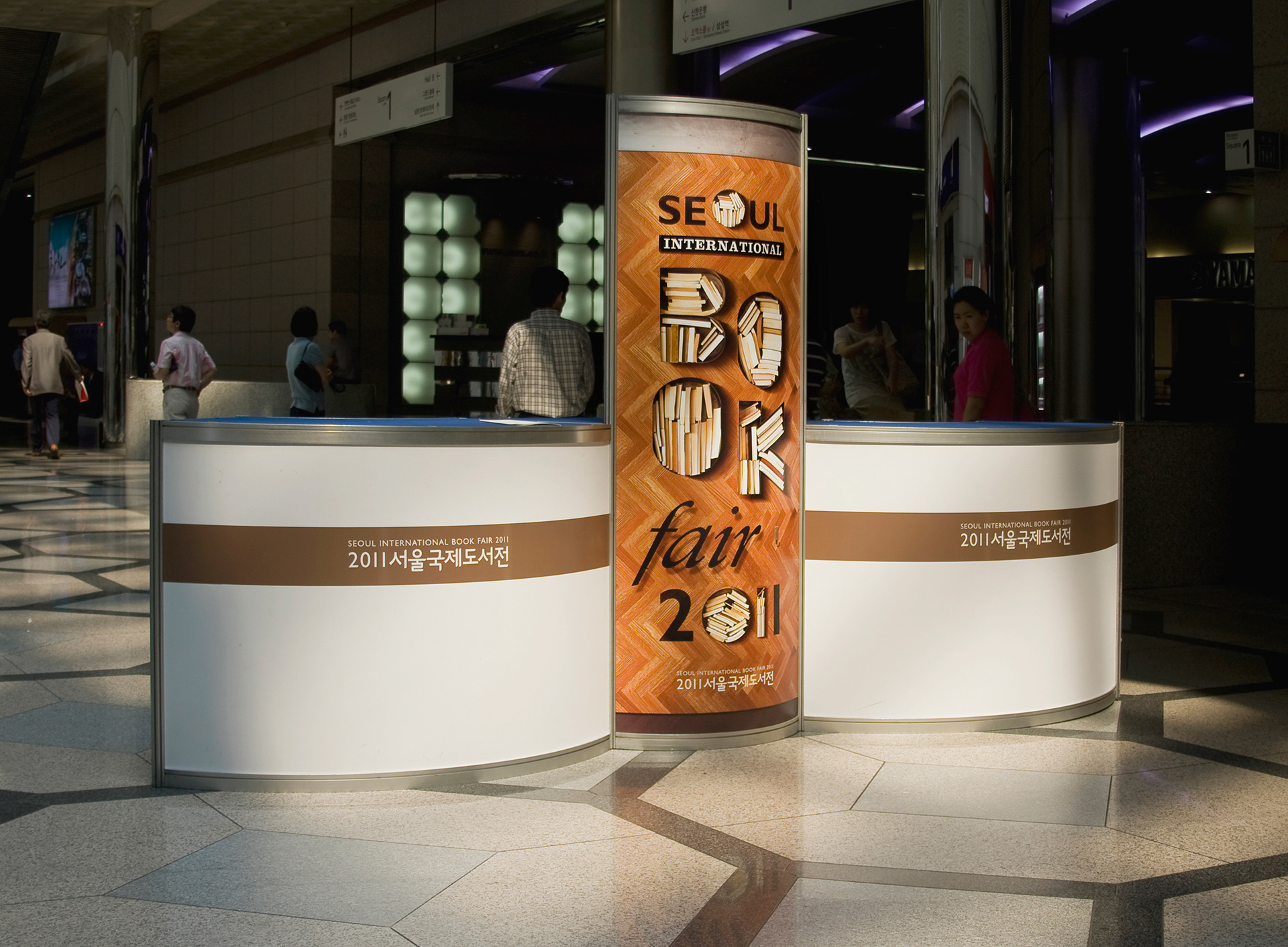
Registration Desk
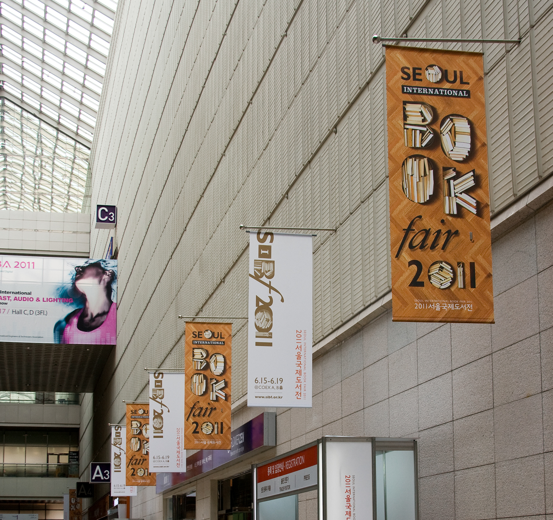
Fanfare Banners
Hall A