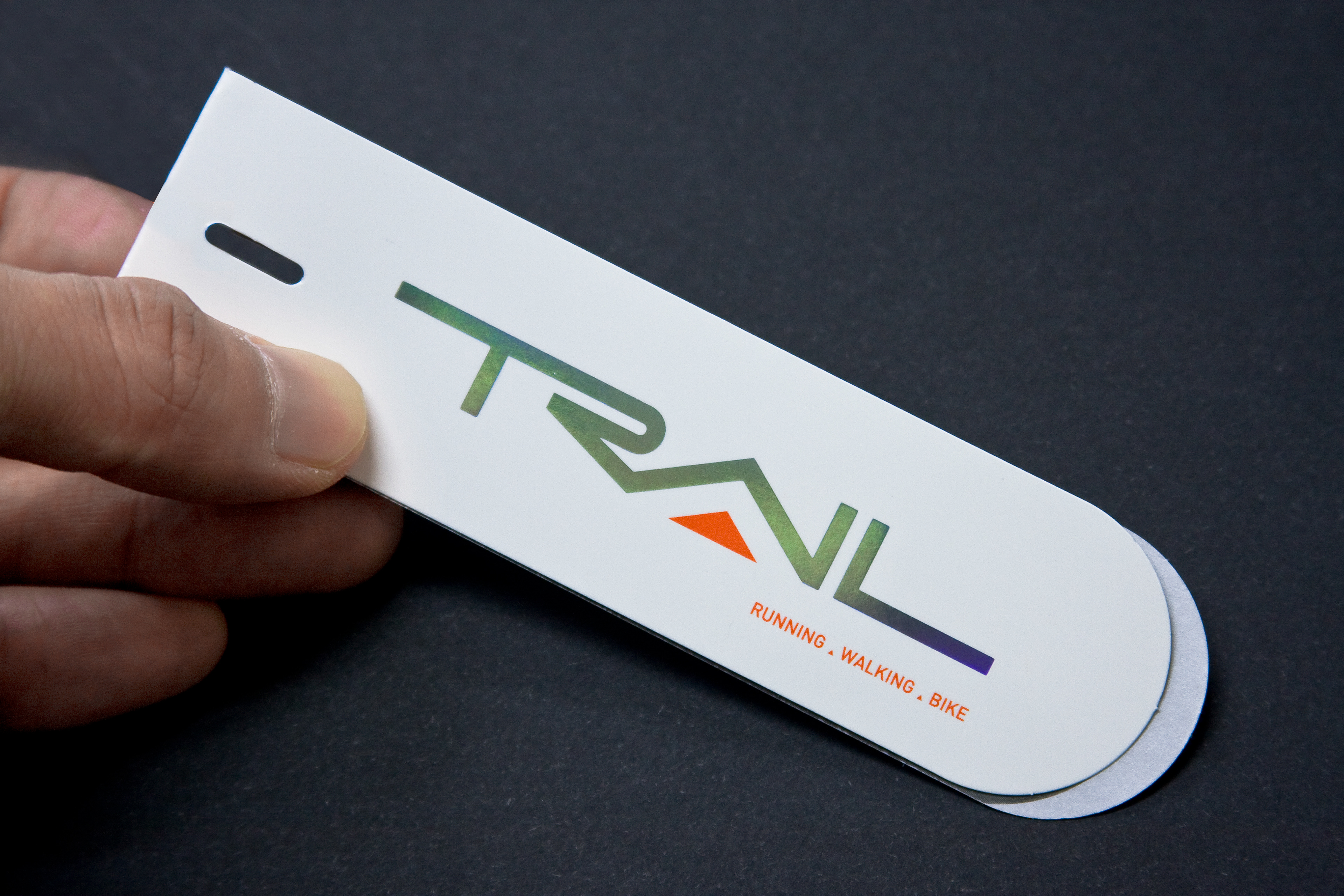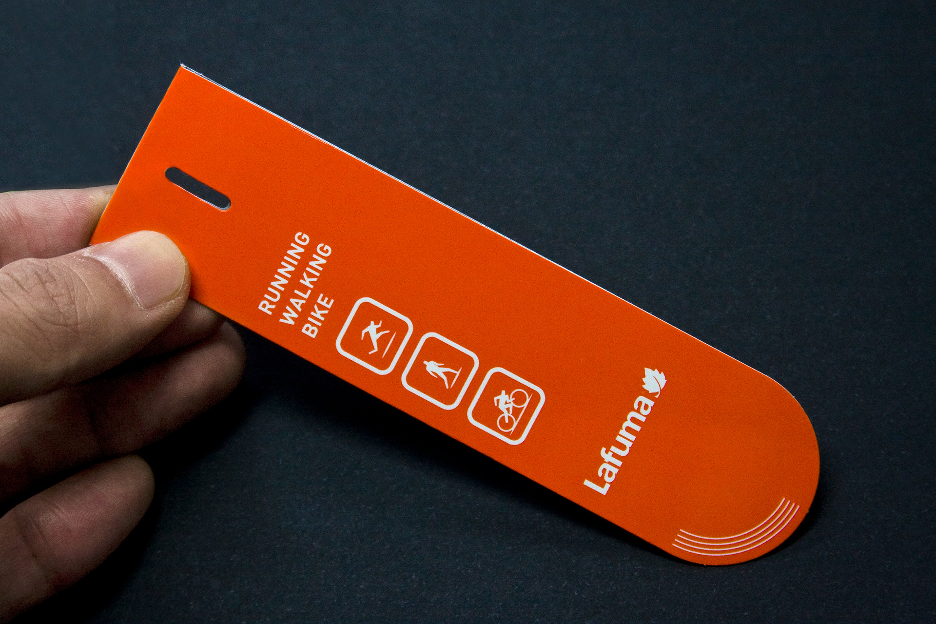

The goal of this project was designing the brand identity for French outdoor brand, Lafuma’s sub-line, 'Trail'. To reflect the meaning of the word "Trail," the lettermark was designed with continuous, unbroken lines. The capital "A" is shaped as a triangle, symbolising a mountain, while incorporating Lafuma’s signature orange color in the center. Given that the Trail logo needed to be applied across various mediums, it was essential to maintain simplicity, ensuring good legibility and practicality, especially in woven applications. The design emphasized adequate spacing, thickness, and spatial composition. Alongside the logo, paper tags and various attachment labels were produced. Additionally, three graphic symbols representing the line’s primary activities—Running, Walking, and Biking—were created to enhance user recognition.
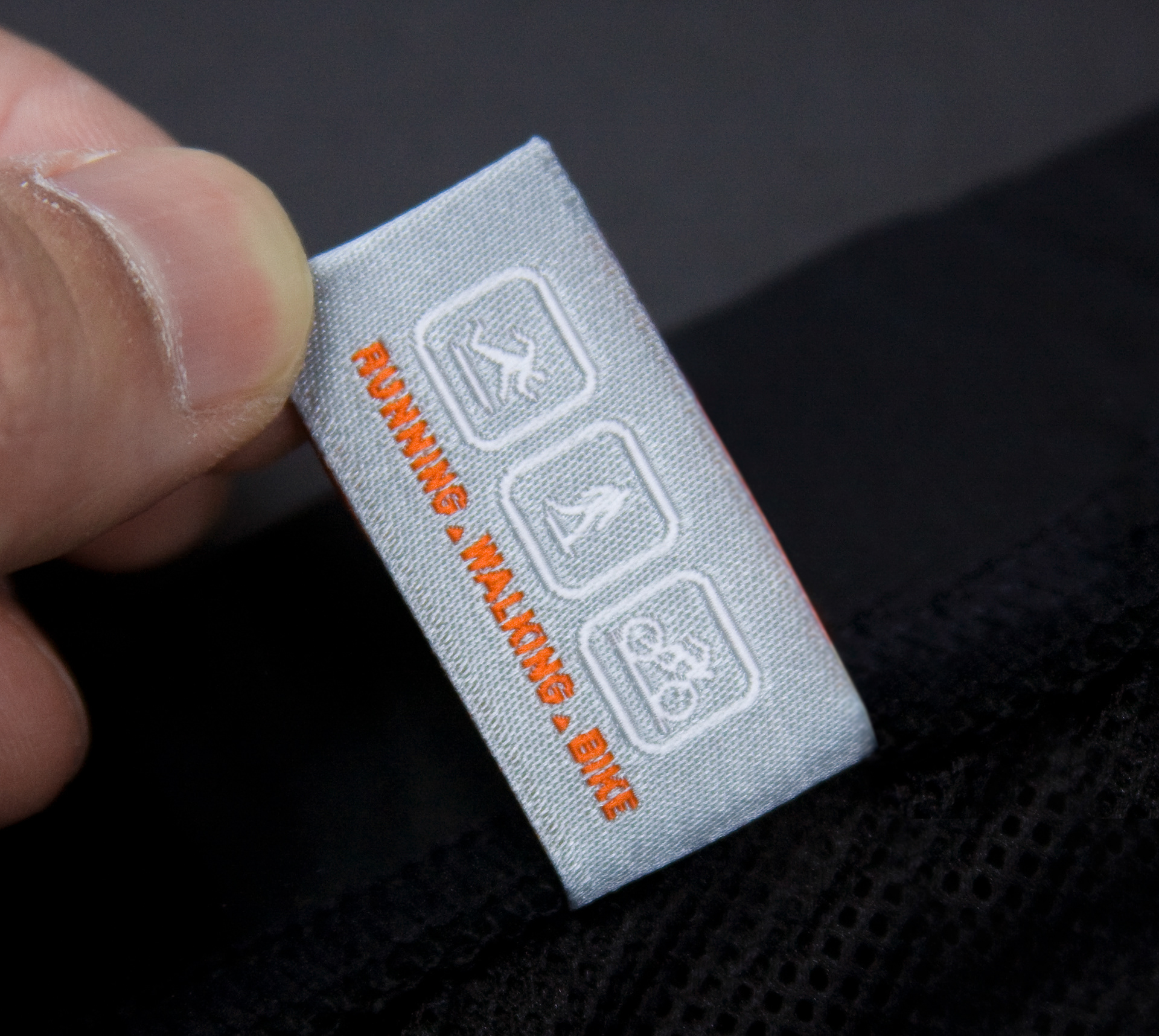
The three graphic symbols were designed with a dynamic yet simple structure, blending straight and curved lines. These symbols move away from the traditional structure of restroom icons, instead emphasizing a sporty aesthetic. Lafuma's signature orange was used as the primary color, with white designated for use against an orange background. The symbols demonstrated successful results across various materials, particularly excelling in readability when woven.
For the paper tags, a holographic foil was applied to the cover logo, adding a touch of flair and highlighting the sporty nature of the Trail line. Inside the tags, a metallic texture was achieved by printing in silver and black duotone. The thread used for the tags was also customized to match the color concept, primarily using silver or white to maintain harmony with the Lafuma brand logo. The spacing and dimensions were carefully aligned with the brand logo, creating a cohesive visual system.


