
Client | Korean Publishers Association 대한출판문화협회
Fair identity design for Seoul International Book Art Fair 2009. The project consists of font design, a poster, a leaflet, and a folder and some materials. The concept of identity design is based on the font specially designed for the fair only and the shapes of the font derive from a book which we can easily recognise.
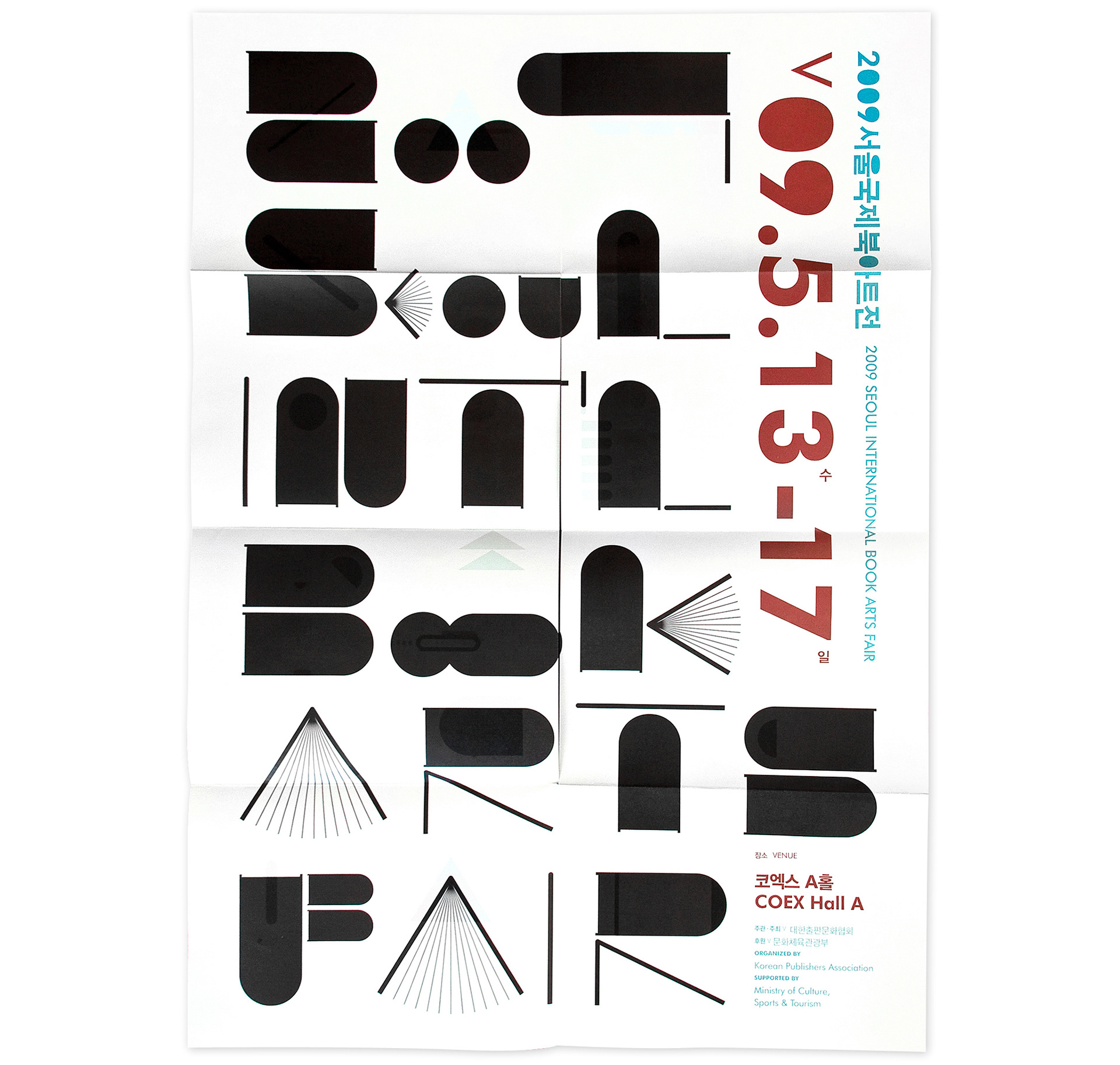
Poster
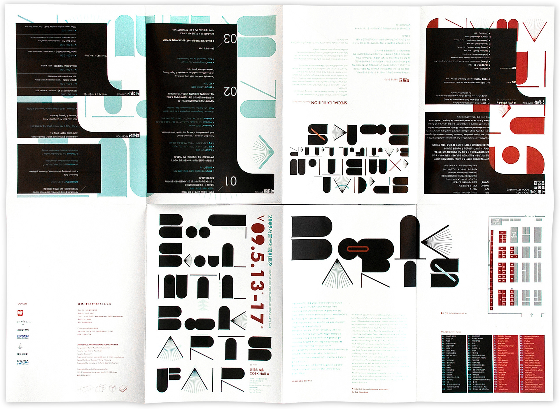
Brochure
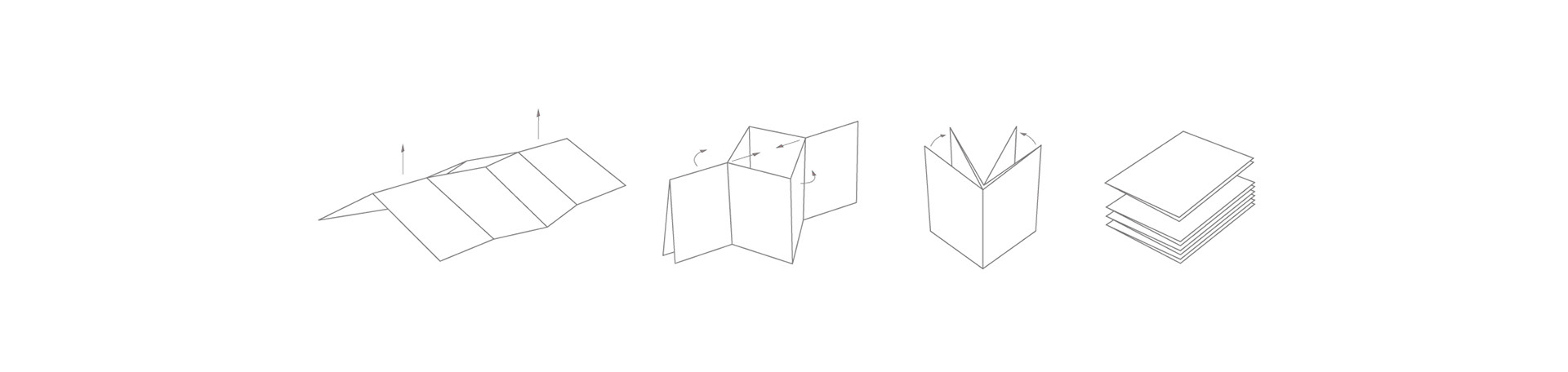
Folding
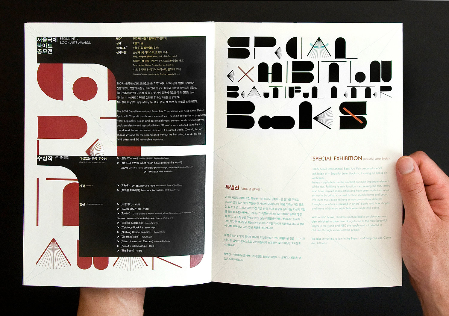
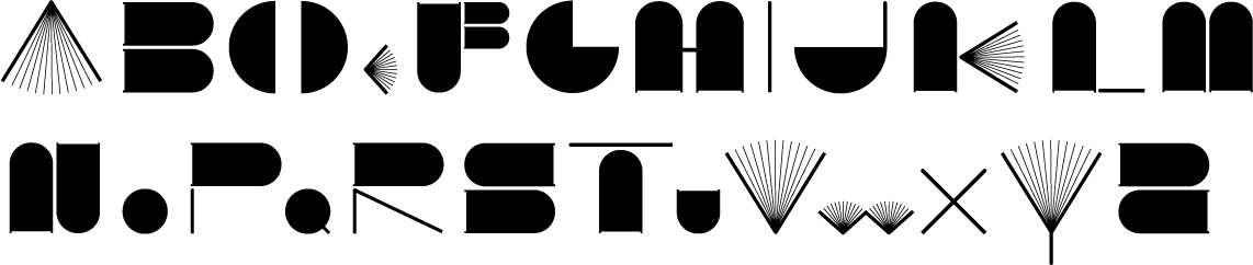
TYPE DESIGN
The font hasstrong characteristic so that it plays a role tounify the whole applications. legibility was not much considered in thiscase because the targets comprise artists,designers and people who are interested in anexperimental style. The strategy of style is focused on the curiosity of those kinds of peopleand helps them feel the art books’ world.
The font hasstrong characteristic so that it plays a role tounify the whole applications. legibility was not much considered in thiscase because the targets comprise artists,designers and people who are interested in anexperimental style. The strategy of style is focused on the curiosity of those kinds of peopleand helps them feel the art books’ world.
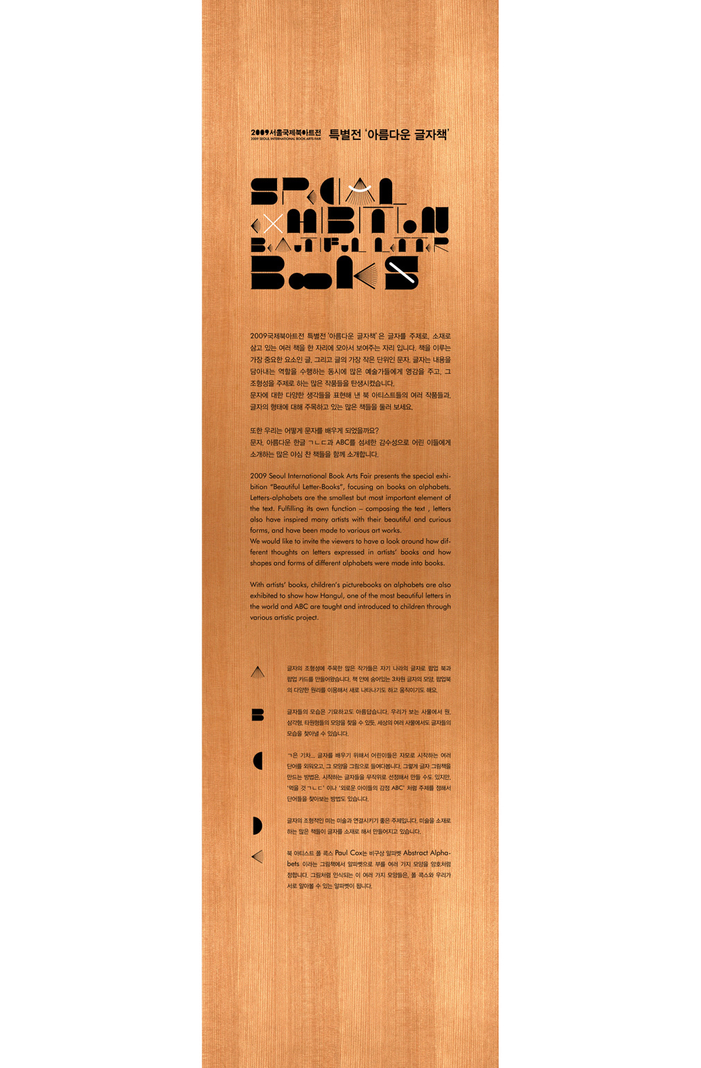
Dry Decal on Wood
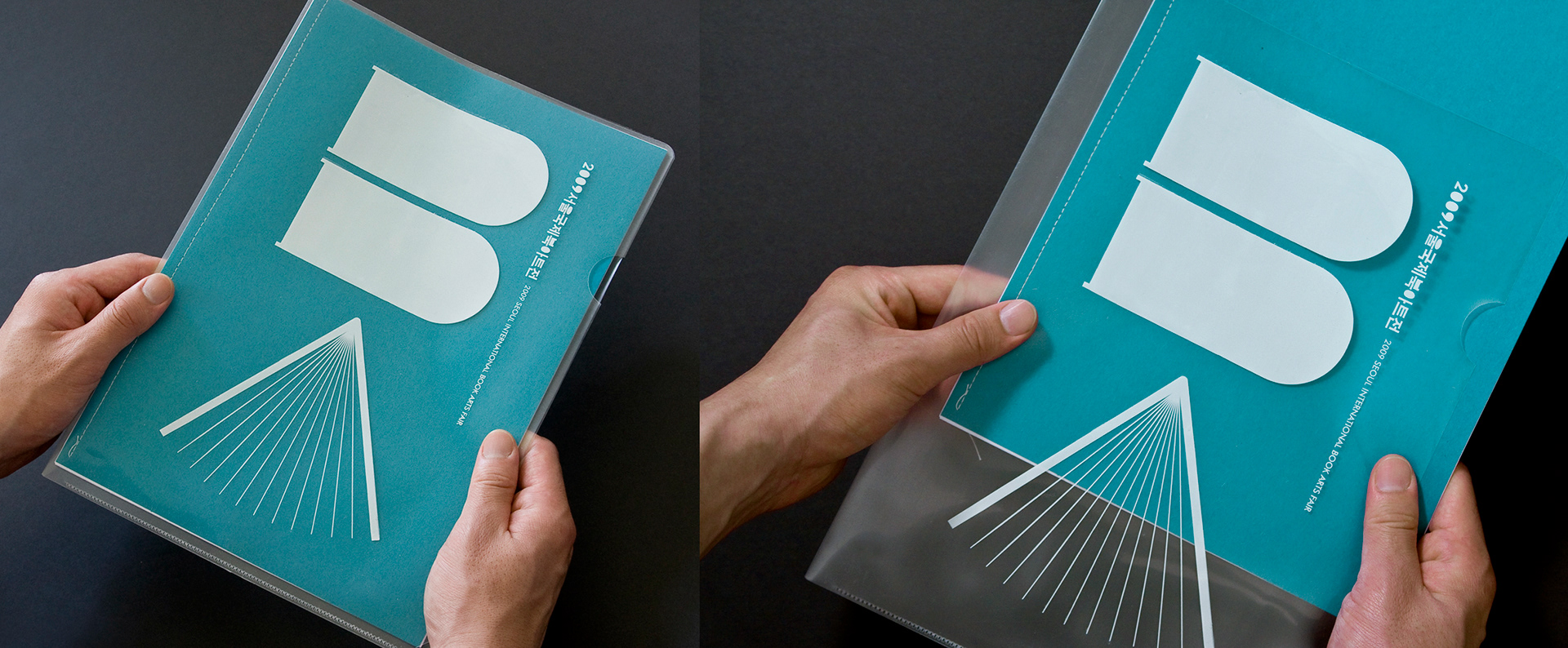
Folder for seminar
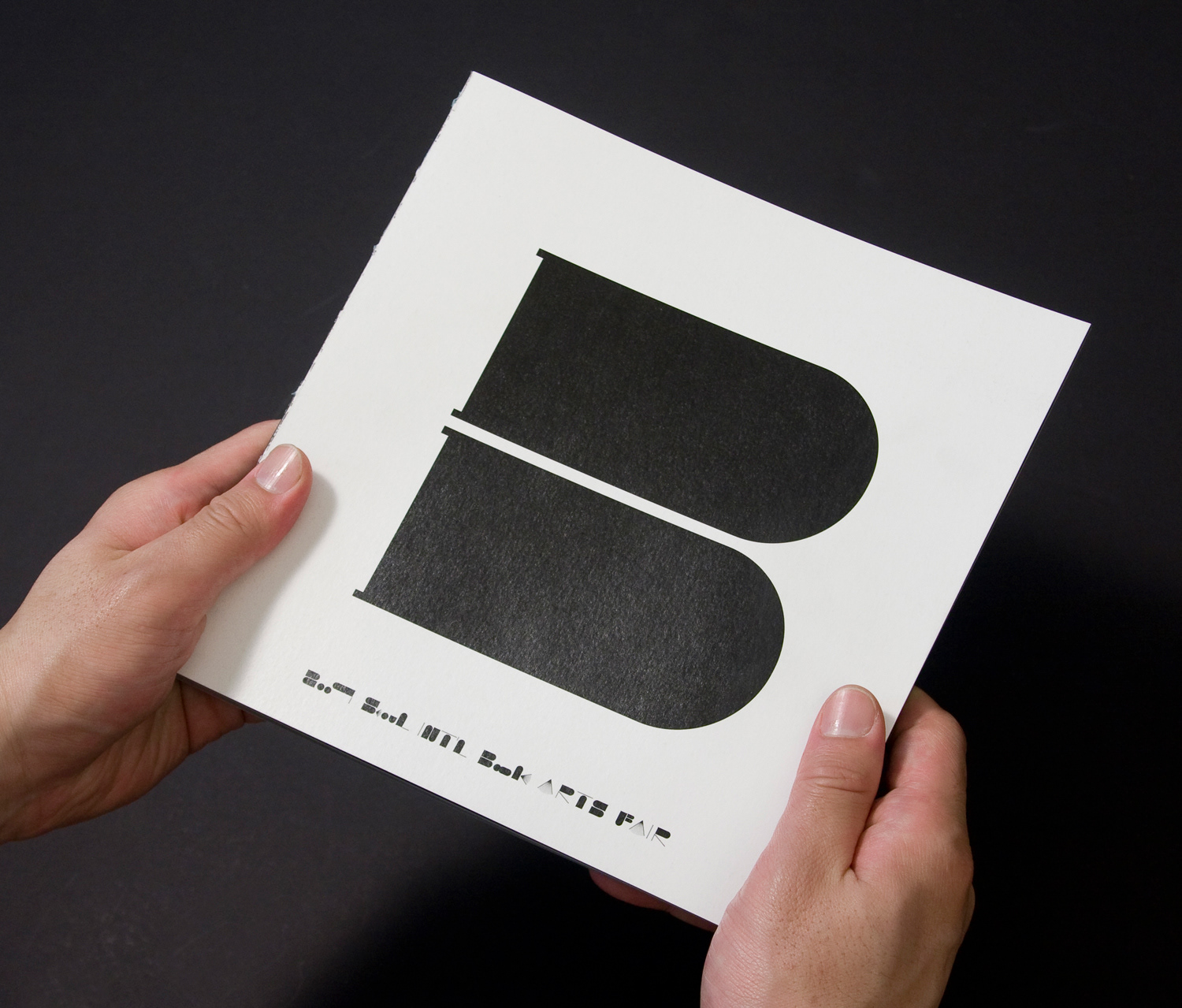
RECORD BOOK
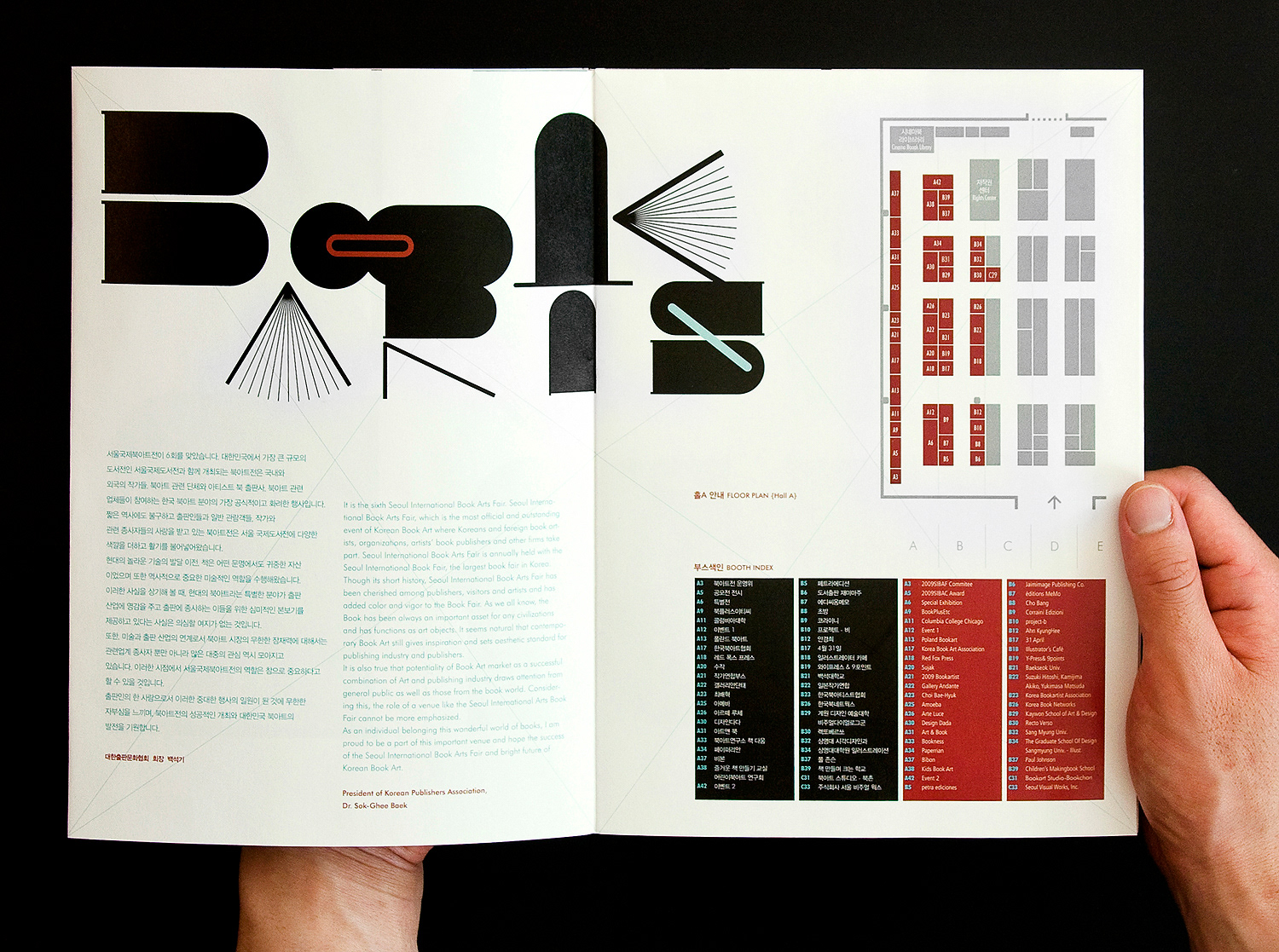
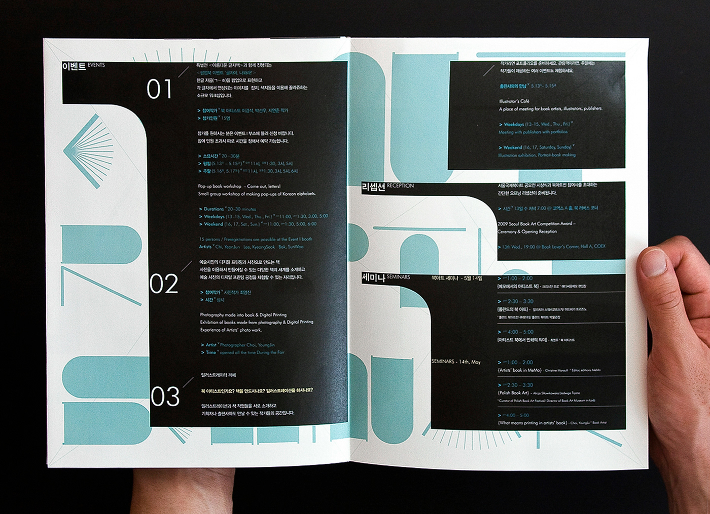
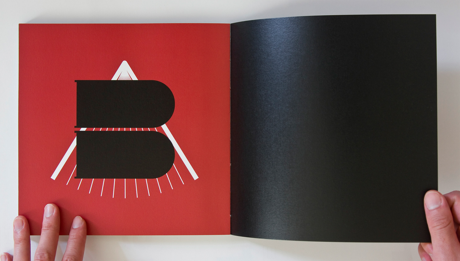
Record book design for Seoul InternationalBook Art Fair 2009. A main concept was come up with the fontindividually designed for the fair. Red andpistachio colours are contrasted deliveringthe lucid impression. Alphabet ‘A’ in ‘Art’and ‘B’ in ‘Book’ are combined to be a kindof symbol and used in the beginning andthe the end of pages. This is simple and easyto be eye-caught in the fair. The red-back-grounded barcode is the point of the backand pistachio colour thread is used on theexposed spine to match the colours. In the pages graphic symbols and iconswere designed to let readers quickly catchinformation.
142 pages | Exposed Spine Binding
Outside Cover
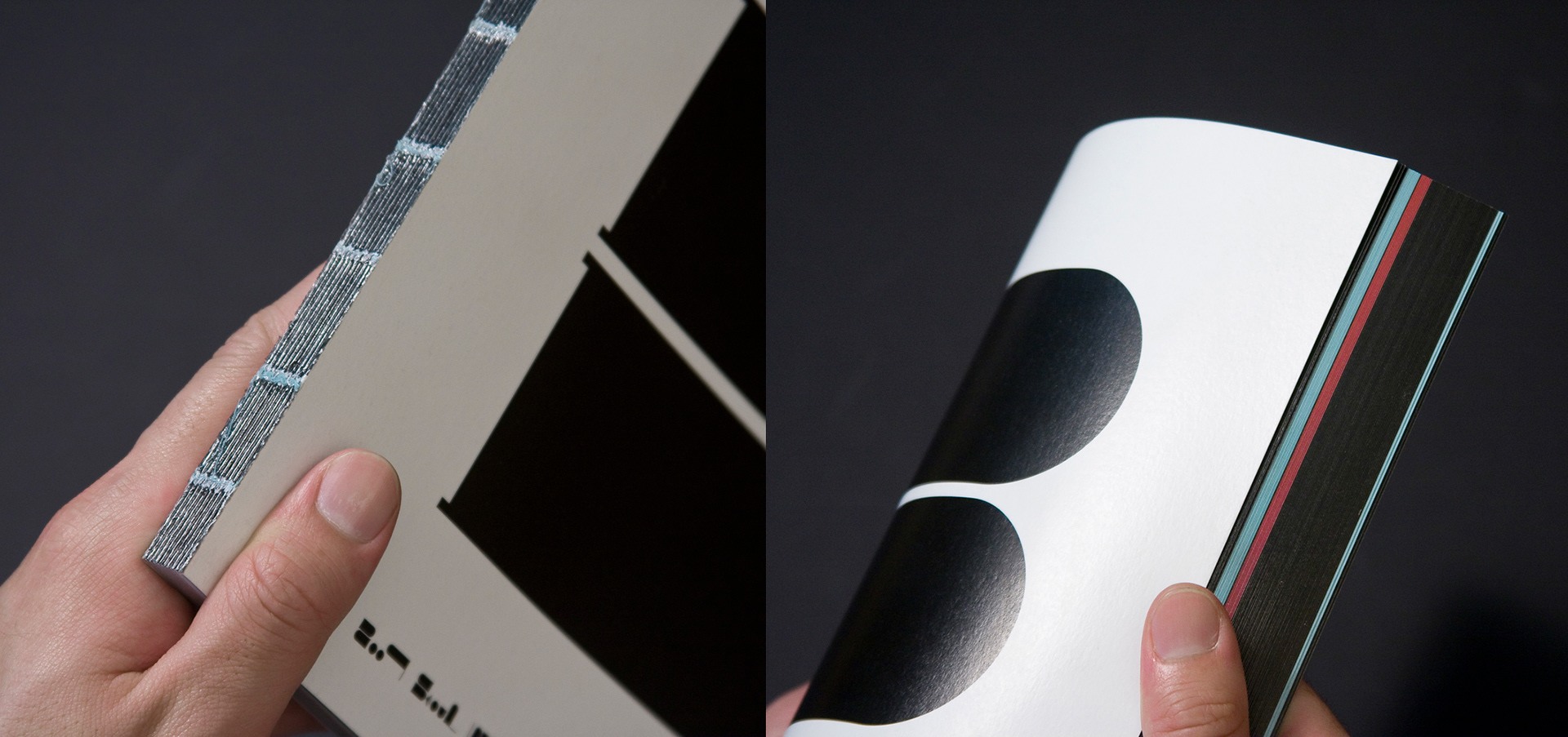
Spine
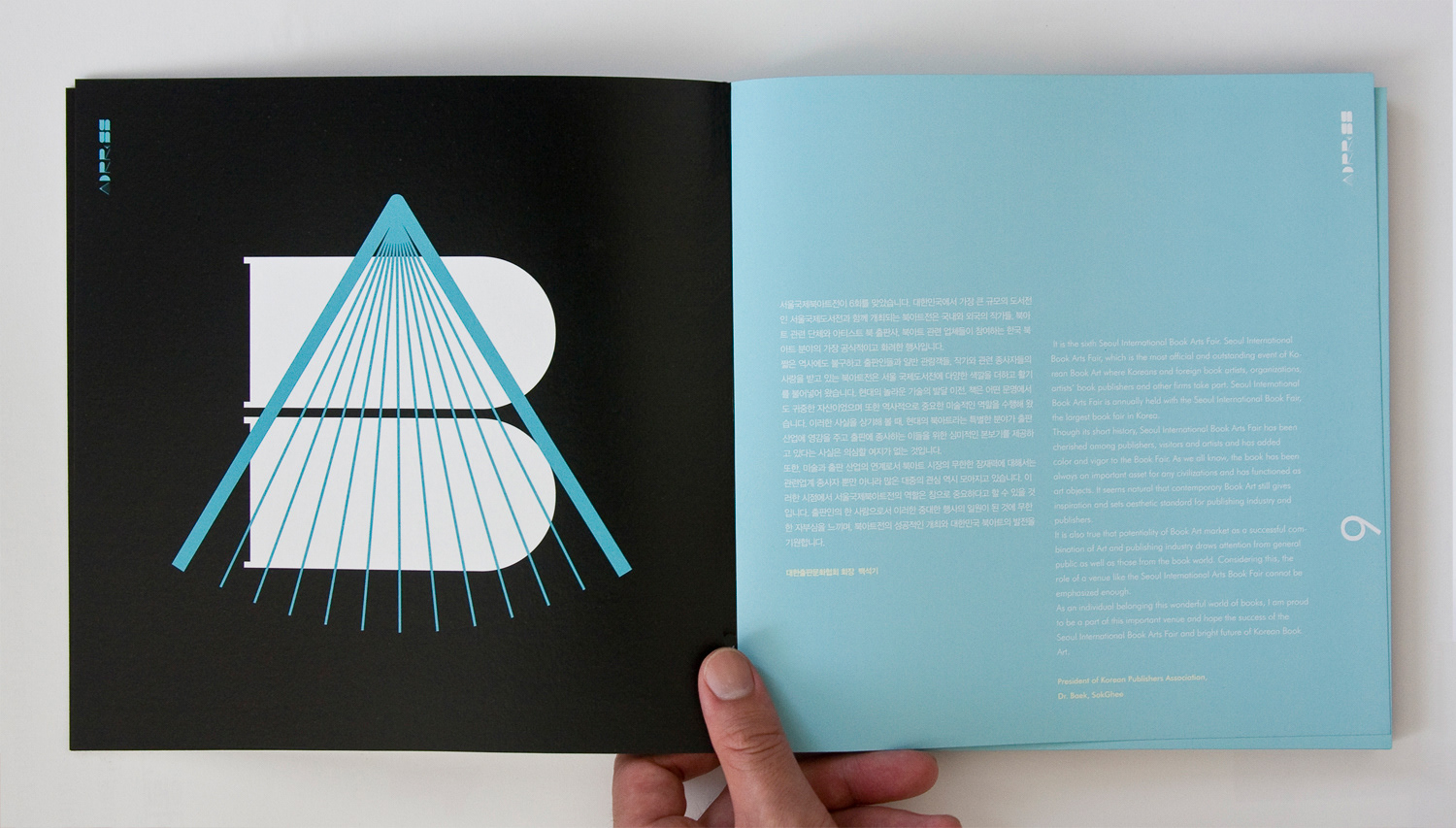
Inside Pages
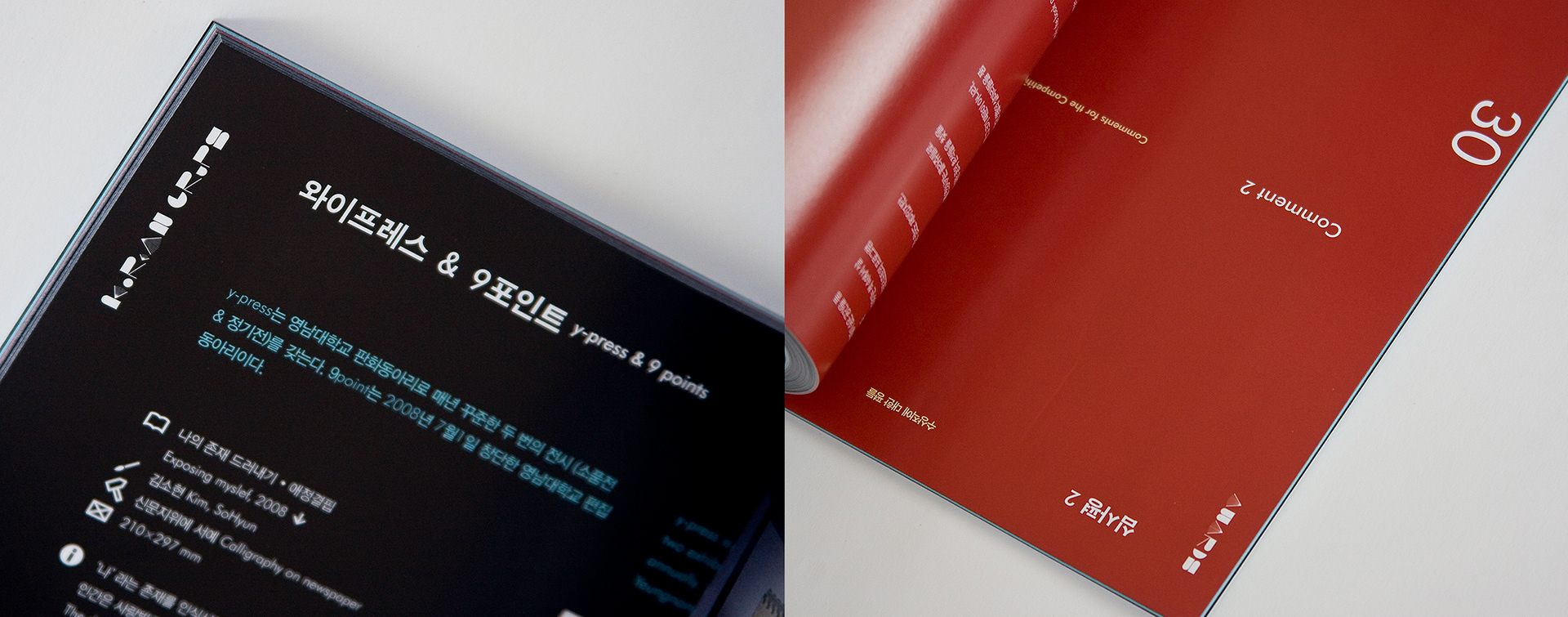
Folio & Icons
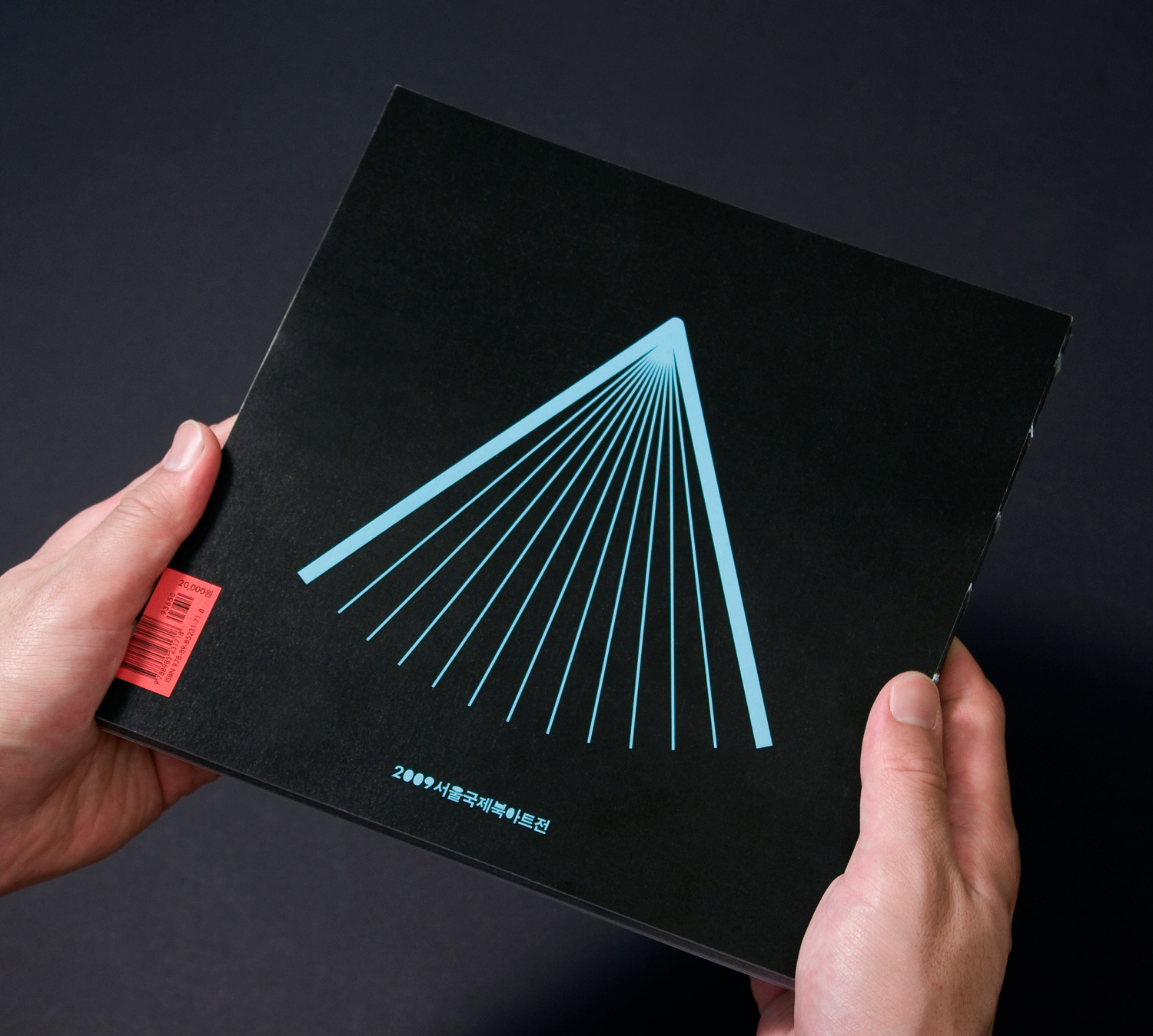
Outside Back